
As a pioneer in the English training industry for foreign teachers, Le Ning Education is one of the earliest English speaking training institutions in Shanghai. In 2017, as a key period of education industry reform, the new college entrance examination policy began to be implemented in Beijing and Shanghai, and the new changes also brought new changes in the education industry, and Lening carried out business integration and brand upgrading according to policy requirements, market demand, and the personal pursuit of students and parents.
REBRAND FOR GROWTH
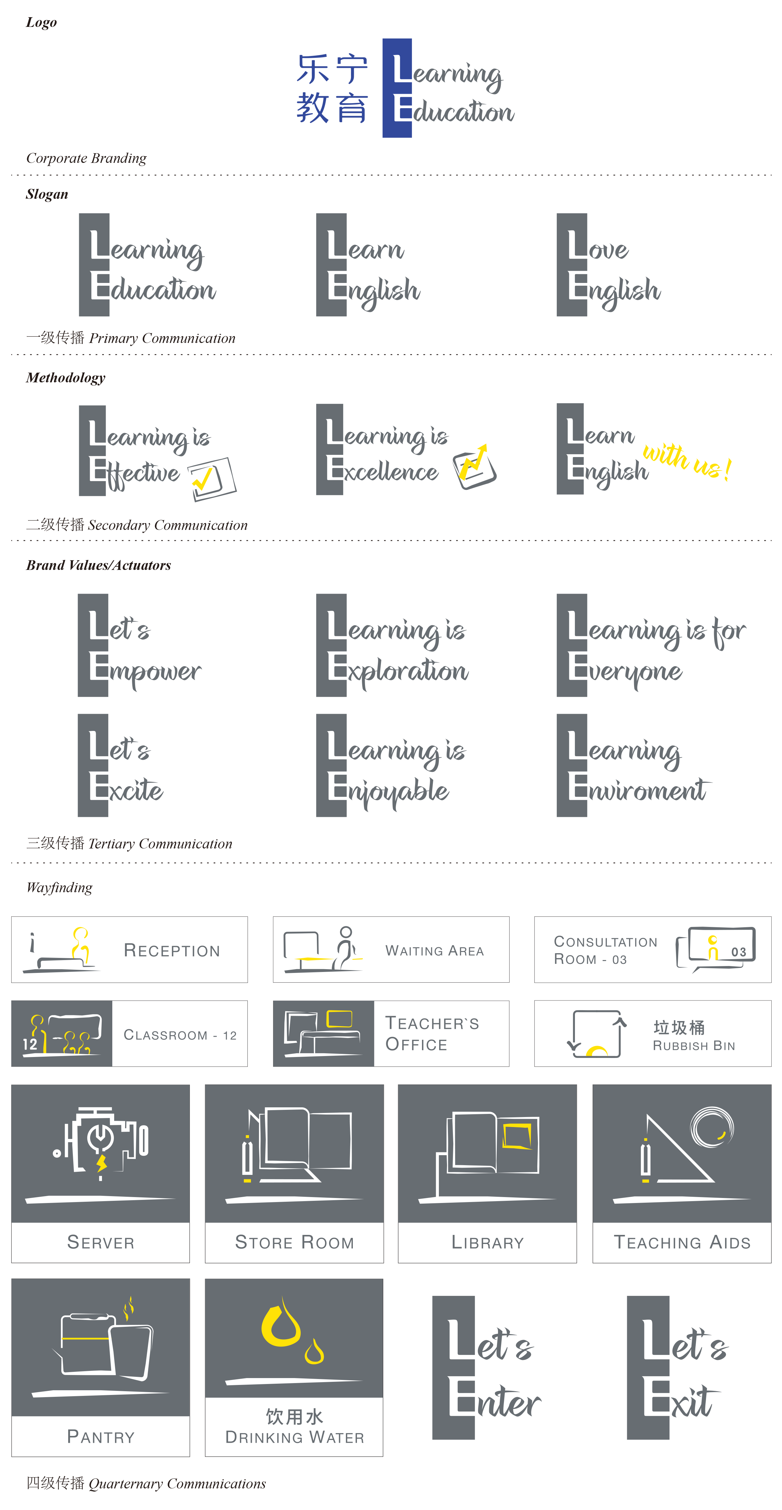
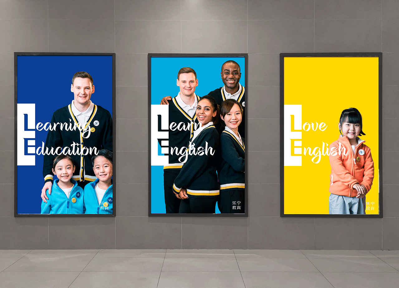
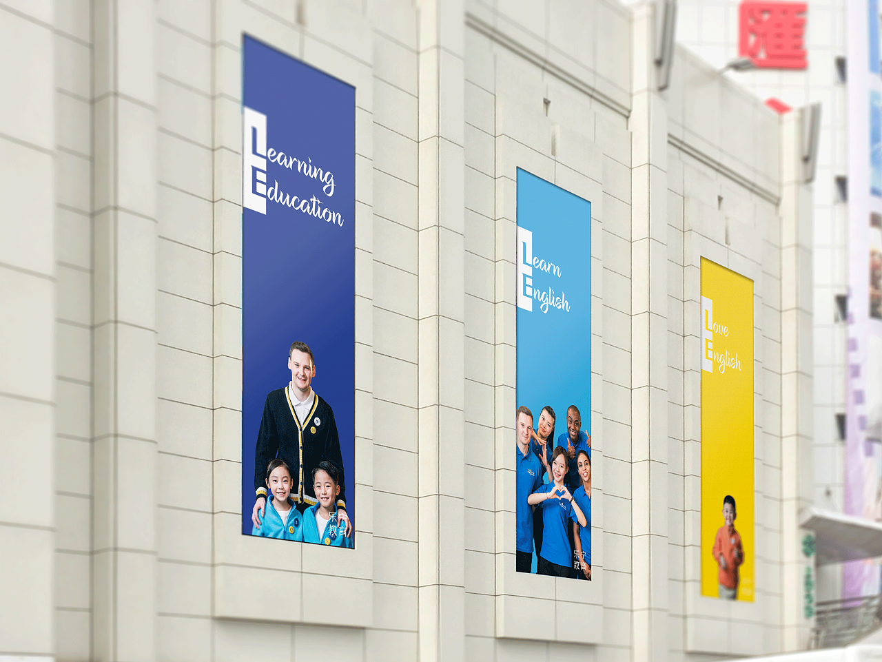
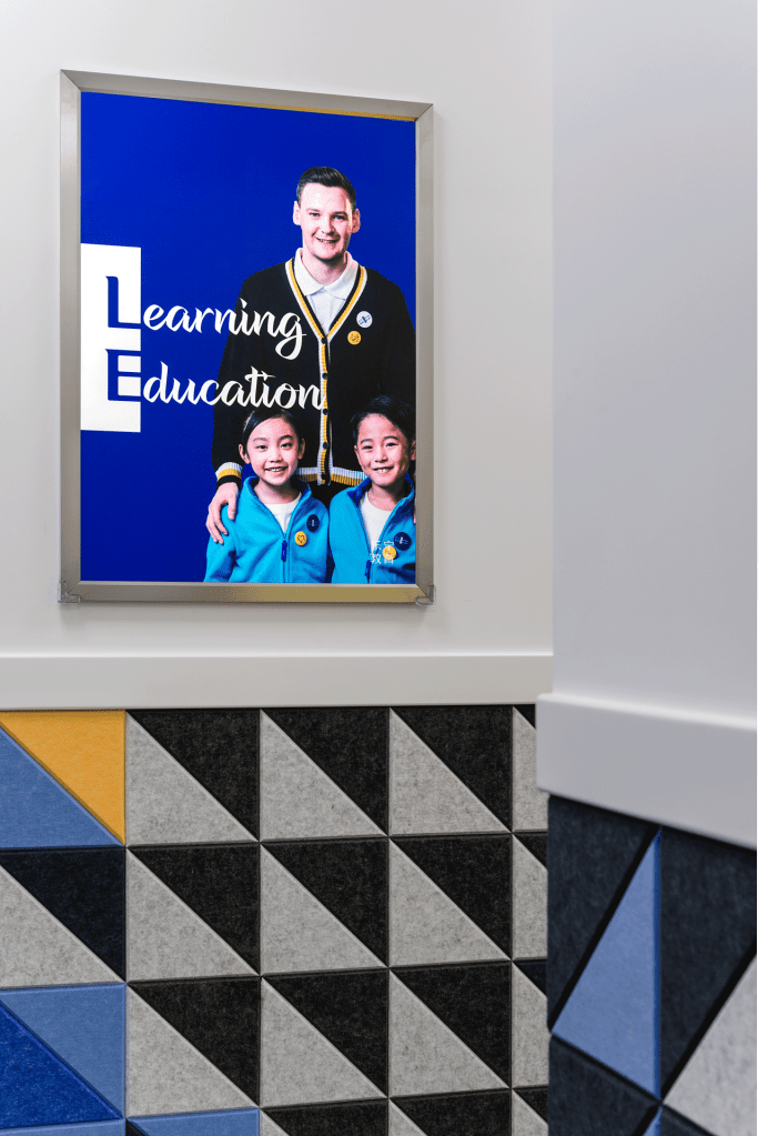
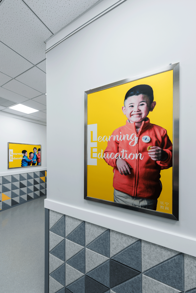
In the design of the brand identity, we pursue a more intuitive and concise expression. The color continues the dark blue of the original logo, and adds a dark gray with strong “inclusiveness” to create an affinity based on professionalism; In larger extended media, the color sequence of the original logo is also maintained and given a deeper application meaning. In the promotional screen, we have developed a background color standard, dark blue is only used as the background of the teacher’s and children’s combination screen, yellow is the background of the child-only picture, and light blue is used for the teacher-only picture.

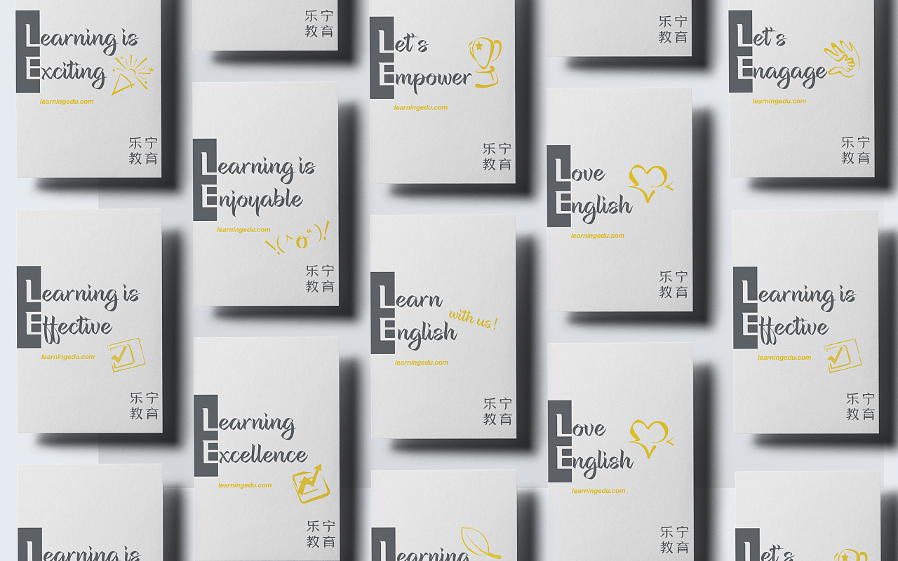
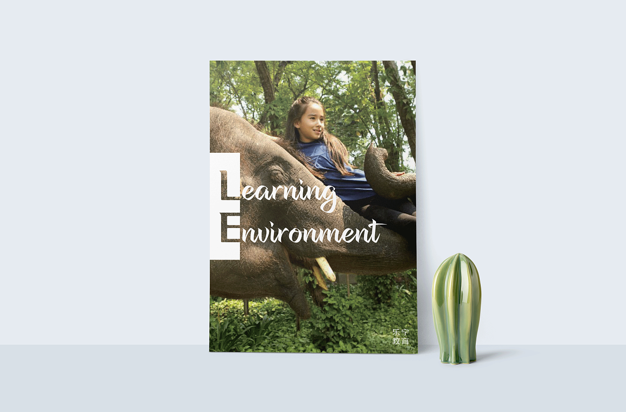
In the brand extension, we split the logo in half, and the split “L&E” vocabulary combination provides more room for expansion and compatibility. It can convey brand concepts, learning attitudes and even teaching characteristics, in the era of test-taking education transformation, practical, interactive teaching and learning relationship has become the mainstream, “L&E” combination vocabulary vividly presents this kind of thinking advantages of finding fun in learning and independent learning in fun.
At the level of market strategy, these combinations are not simply vocabulary games, but clearly structured communication logic. Under this logic, the “L&E” vocabulary combination covers a wide range of words, showing the joy of English learning, which motivates and inspires children, advocates integrity, and inspires learning.
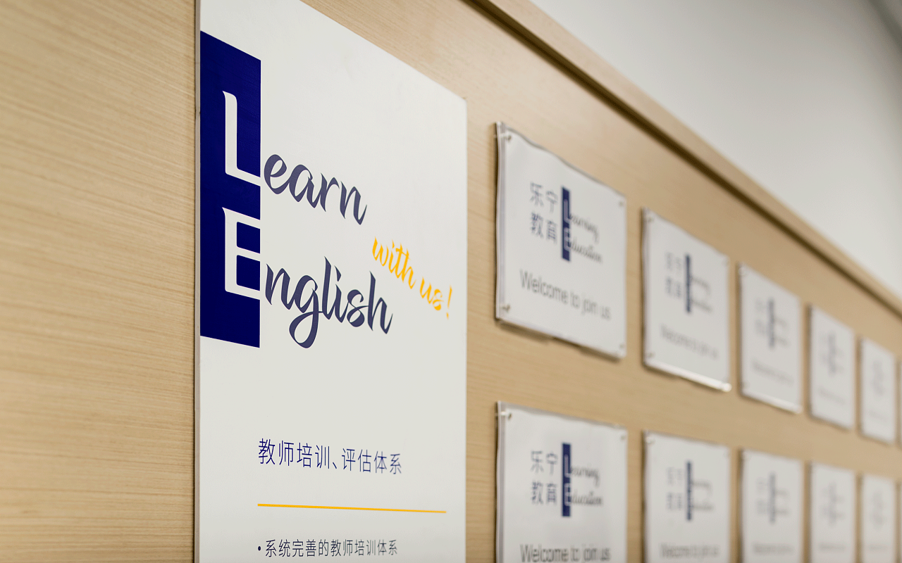
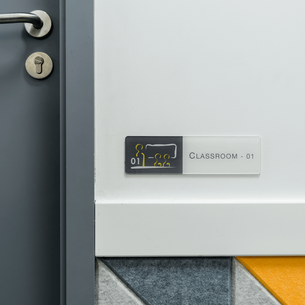
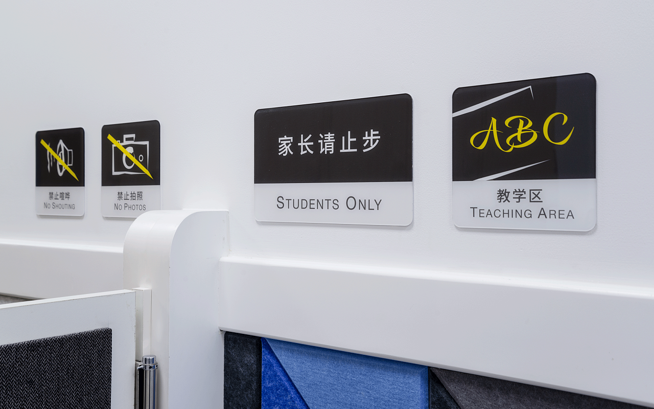
In the design of the space guide, we extracted and continued the design language of Chinese and English fonts in the logo to maintain the unity of the image as a whole.
Slogan
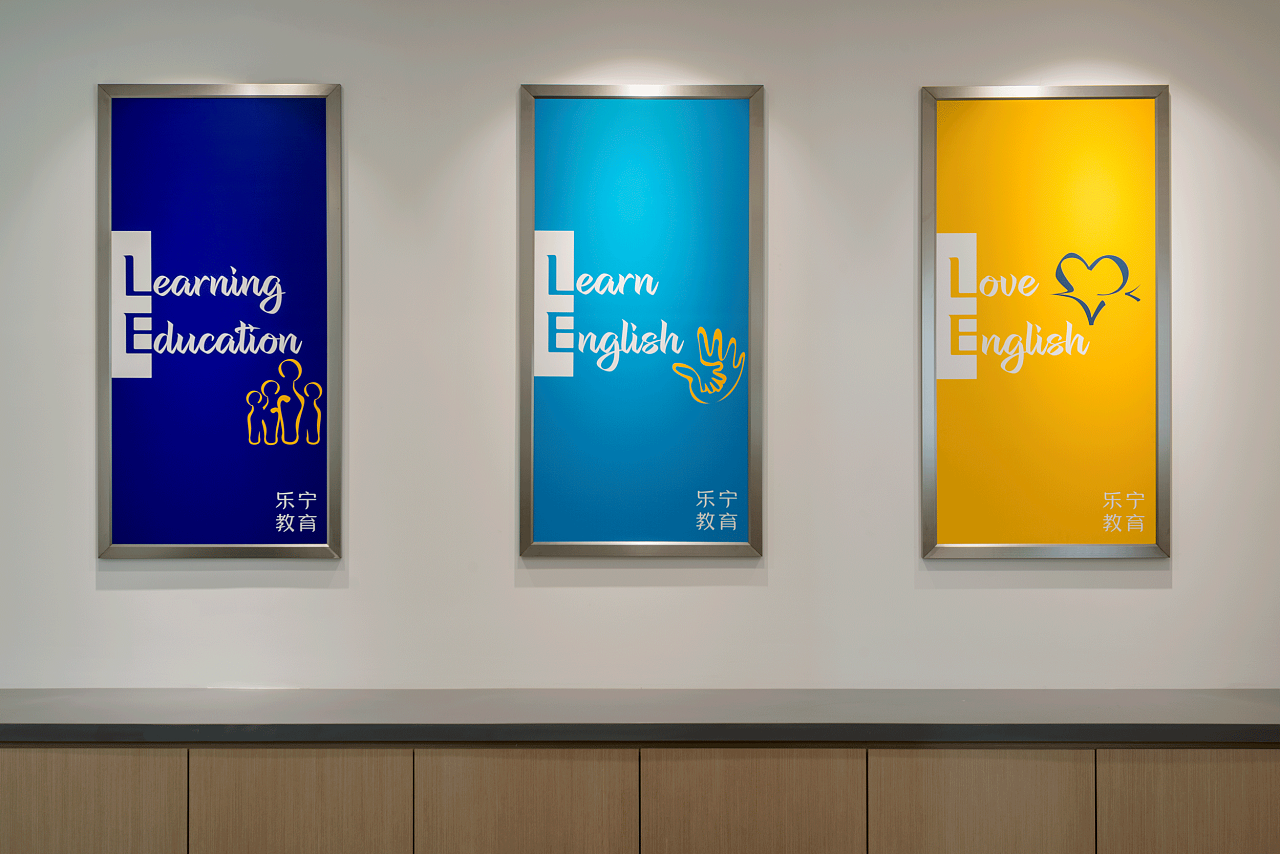
“Learning Education, Learn English, Love English. ” is our refined and summarized slogan, which is used as a first-level brand communication in the advertising screen and space.
Methodology
The curriculum system that keeps pace with the times, the multi-dimensional monitoring of teaching effects, and the strict teacher recruitment and training system are the important advantages of Lening’s stable development in the fierce industry competition.
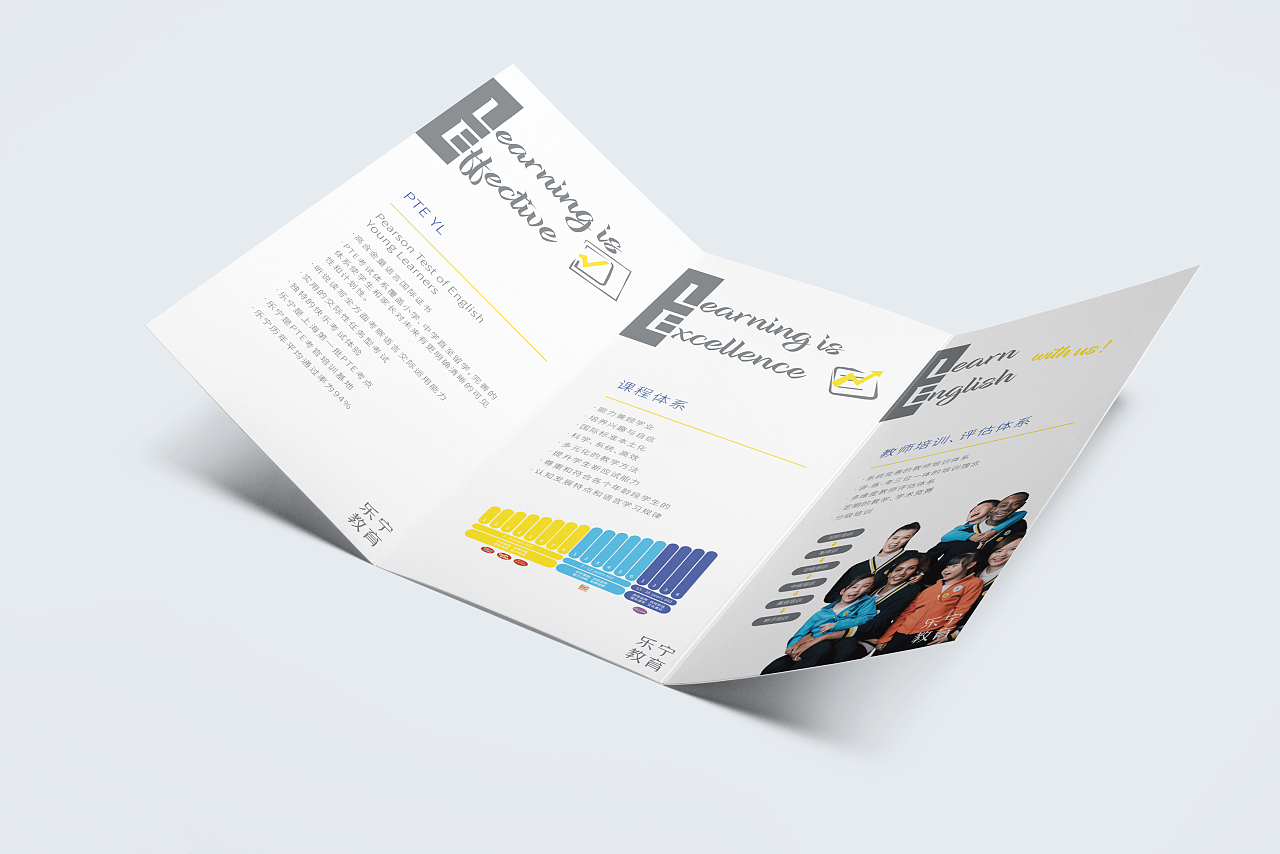
The second-level brand communication vocabulary is more vertically oriented to the audience. In addition, richer expanded content appears in different forms, and it shows its own advantages and service content in a more direct way at the third level of communication.
Brand Values / Actuators

Brand Video
At the beginning of the project, we conducted in-depth interviews with the founders and core teams, and visited several representative teaching centers. We have found that in addition to the professionalism and rigor of the education industry, Lening is characterized by sincerity, inclusiveness, attentiveness, and diversity. Through deeper exploration, we have found a visual presentation that conforms to the core of the spirit of Le’ning, which is clean, direct, inclusive, and diverse. As an element of the logo, “LE” is drawing infinite combinations of possibilities.
Screen colors maintain the continuity of the original brand colors and give them deeper application significance. Dark blue is only used as the background for combined images of teachers and children, yellow is the background for images of only children, and light blue is used for images of only teachers.
In the corporate image promotional film, there is no narration and story line, and we also abandoned the classroom environment of conventional advertisements in the same industry, but chose green studio shooting, and endowed the image with a new brand color background through post-processing, focusing the screen on these Originally as the school teachers and students themselves. We also know that the performance of these “extras” is not perfect, but their interaction is real and normal in teaching, which is unmatched by professional commercial models. Although it is difficult to guide during shooting, we insist on honesty way of conveying truth.
We have recruited teachers of various colors and nationalities, some of whom are not from English-speaking countries. Because from the interviewed parents, we learned that in actual teaching, there is no intuitive relationship between teaching ability and skin color or even nationality, and Le Ning also made no secret of this.
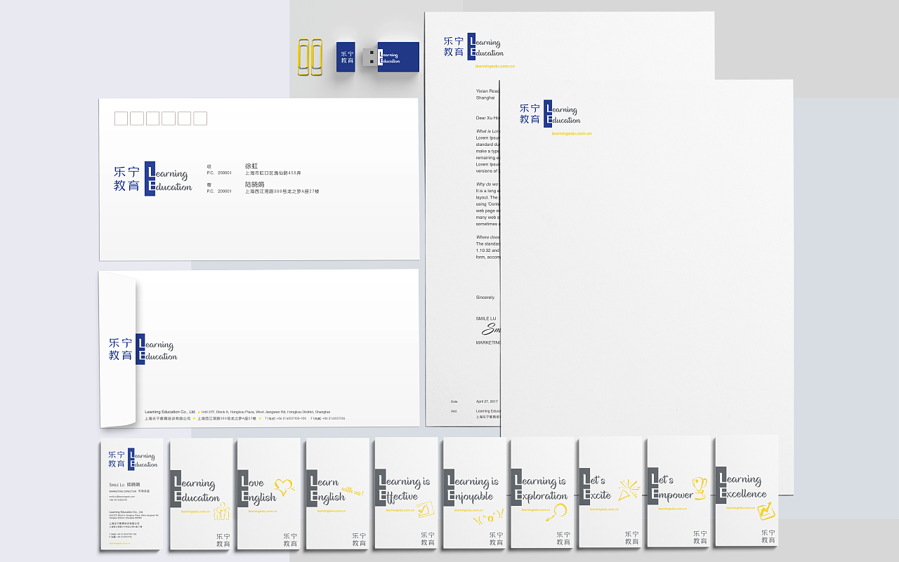
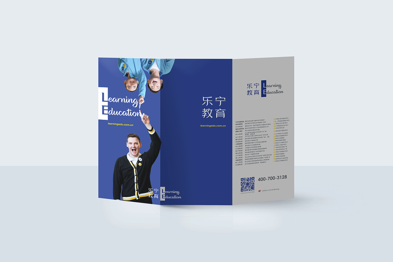
Brand Plane Extension
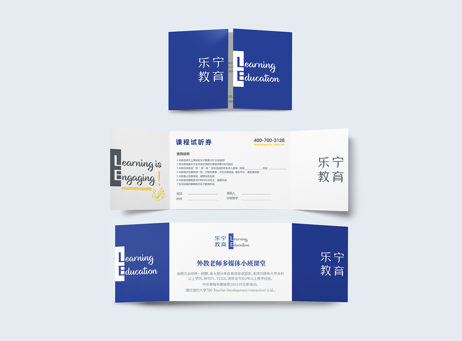
We extend the way of logo splitting to three dimensions and space. In the case of paper media, we present the complete logo on two display surfaces, adding more interactivity and memory points to the traditional carrier through such a “naughty” approach. On the promotional leaflet of the event, we designed a “window” that opens in opposite directions. When closed, it is a complete logo image. Opening it is like opening a window. The original complete logo is also divided into left and right sides, front and back sides. with more detailed text information.

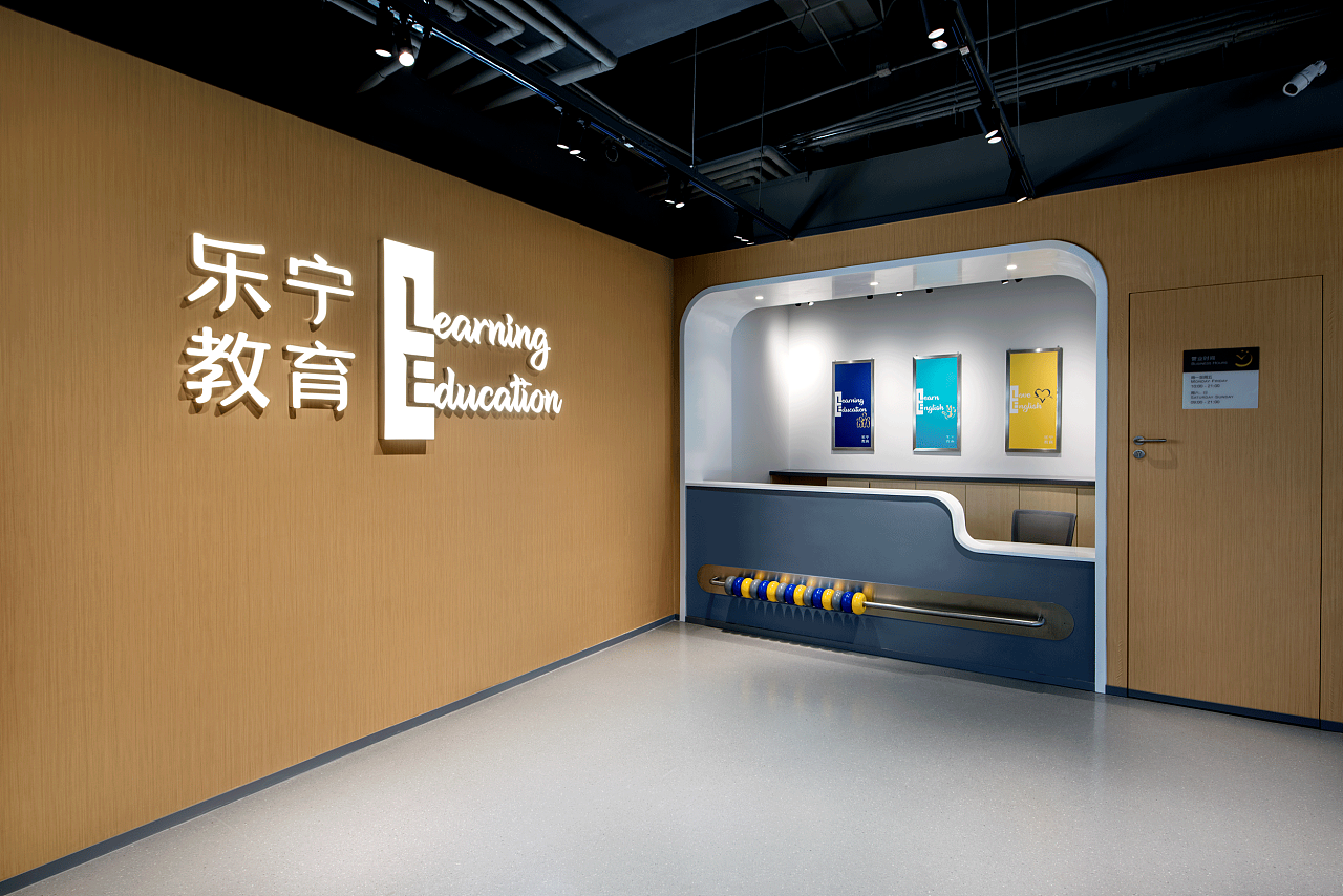
Brand Space Extension

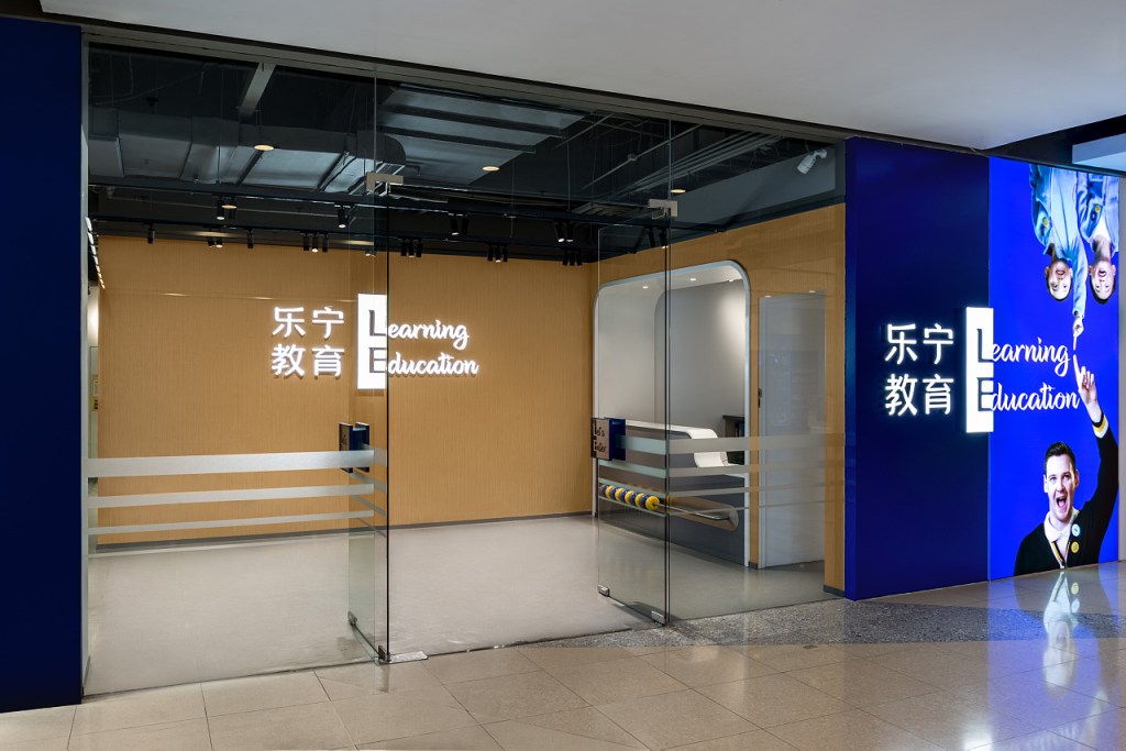
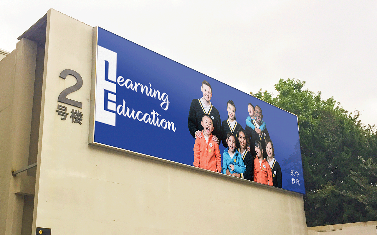
For the gate design of the campus, we combined the acrylic Logo light box with the advertising light box, which is extremely rare. The logo light box is permanent, and the screen light box is a replaceable structure, and the screen and text content can be replaced in real time according to the brand and marketing needs. Since it is currently in the early stage of brand image renewal, the combination of “Learning Education” is still the primary content to be exposed.
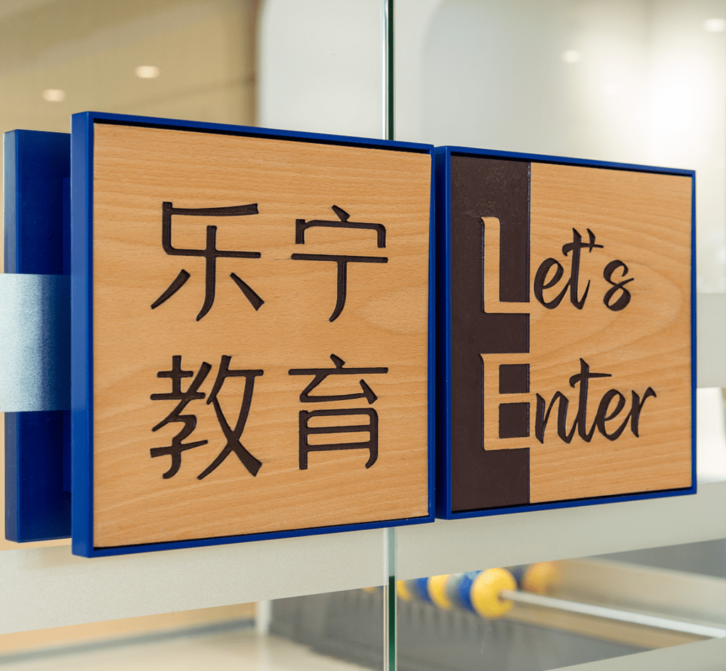
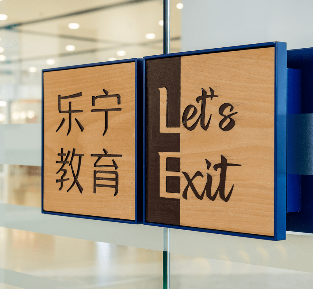
We moved some thoughts and let the divergent thinking start to express from the entrance. We made doorknobs from the expanded combination of split logos, which are respectively placed on the two doors, facing both inside and outside of the space at the same time, creating a stronger sense of participation.
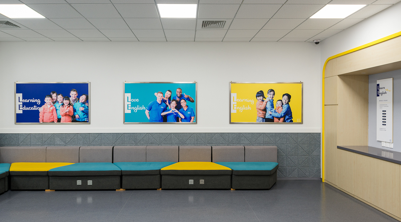
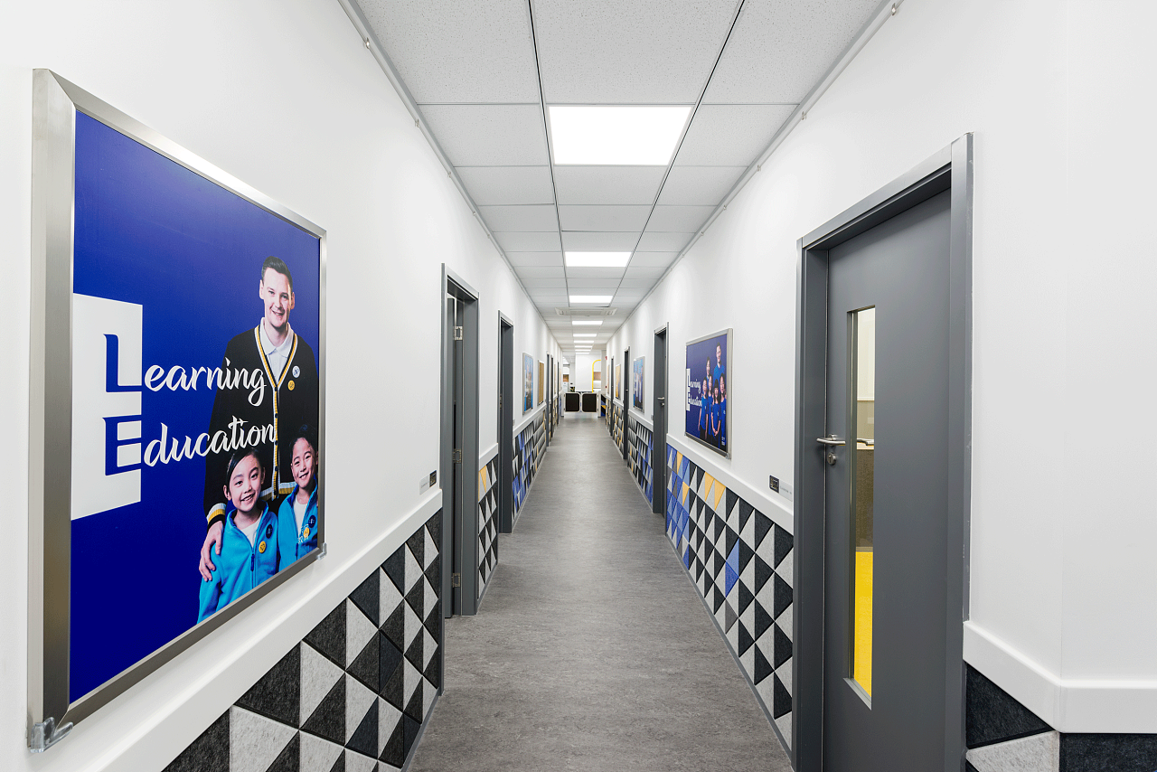
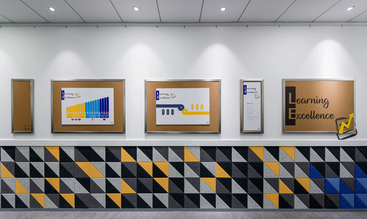
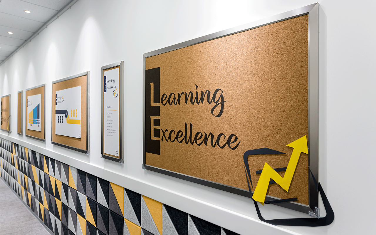
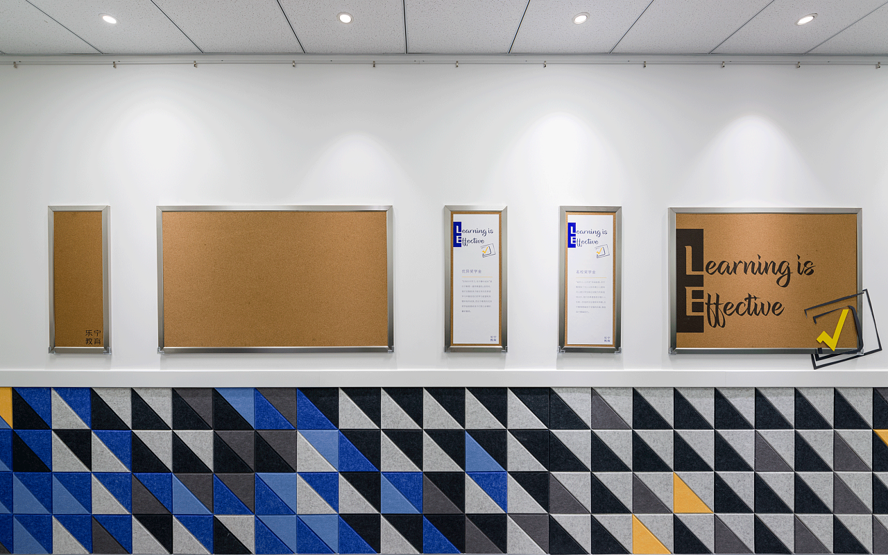
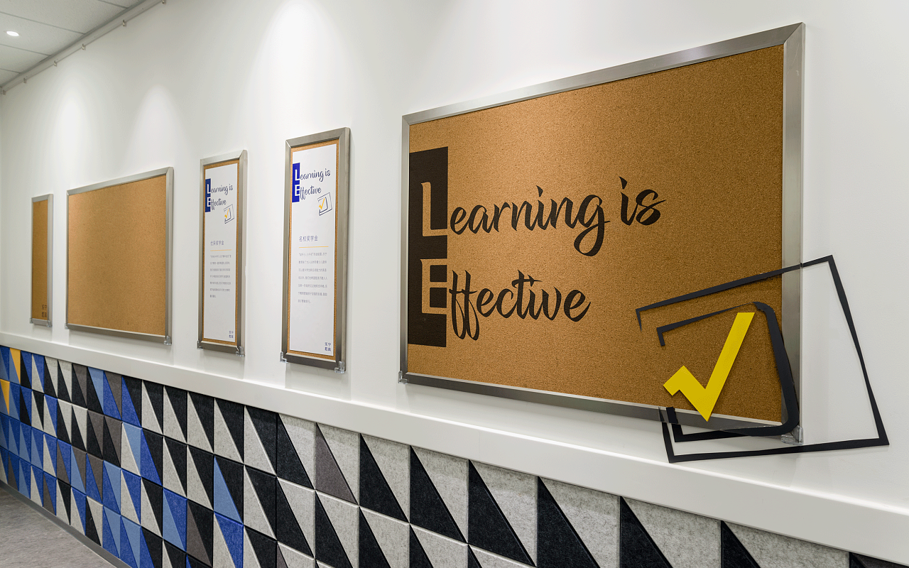
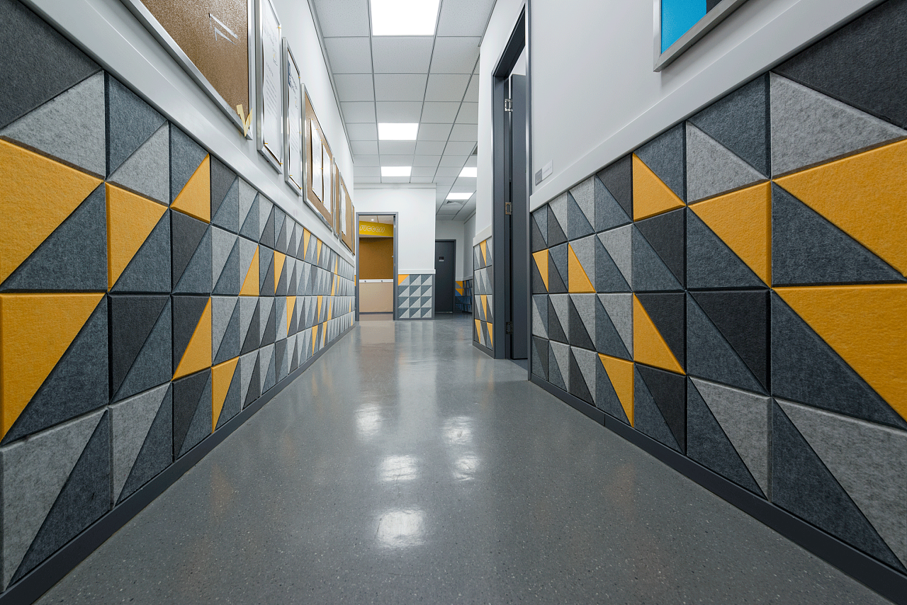
The aisle in the teaching area was originally long and narrow, and the sound-absorbing panel module can help reduce bumps and reduce mutual interference between the outside world and the teaching environment. We have made visual and functional planning for this. Above the waistline is mainly for visitors and parents. This part presents the advertisement pictures of teachers and students, arranged according to the rules of characters (corresponding to the exclusive color); below the waistline is from the perspective of children, creating a colorful sensory environment.
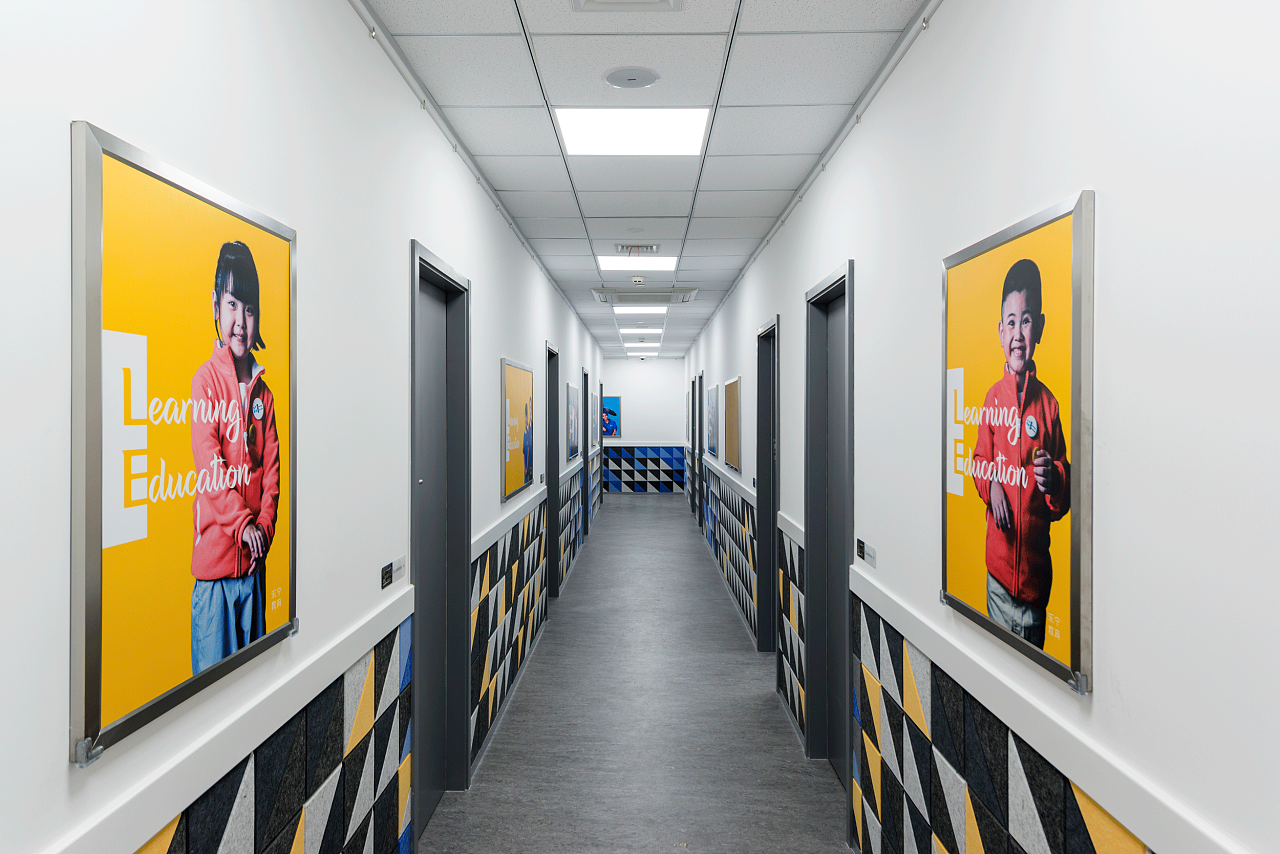
These sound-absorbing panels use right-angled isosceles triangles as a module and are collaged on site. On the whole, it is arranged in a mosaic gradient with the law of grey-blue-gray. Gray is the basic color, and the color corresponds to the background color of the poster picture above, and the distribution is jumpy; at the corner of the wall, we increase the proportion of dark blue, which forms a clear difference with the gray walls on both sides, so as to prevent children from moving quickly. The judgment of spatial structure appears wrong. We use these arrangement methods and color rhythms to keep the long corridors childlike and smooth, encouraging and caring for children to learn, play and grow from multiple dimensions.

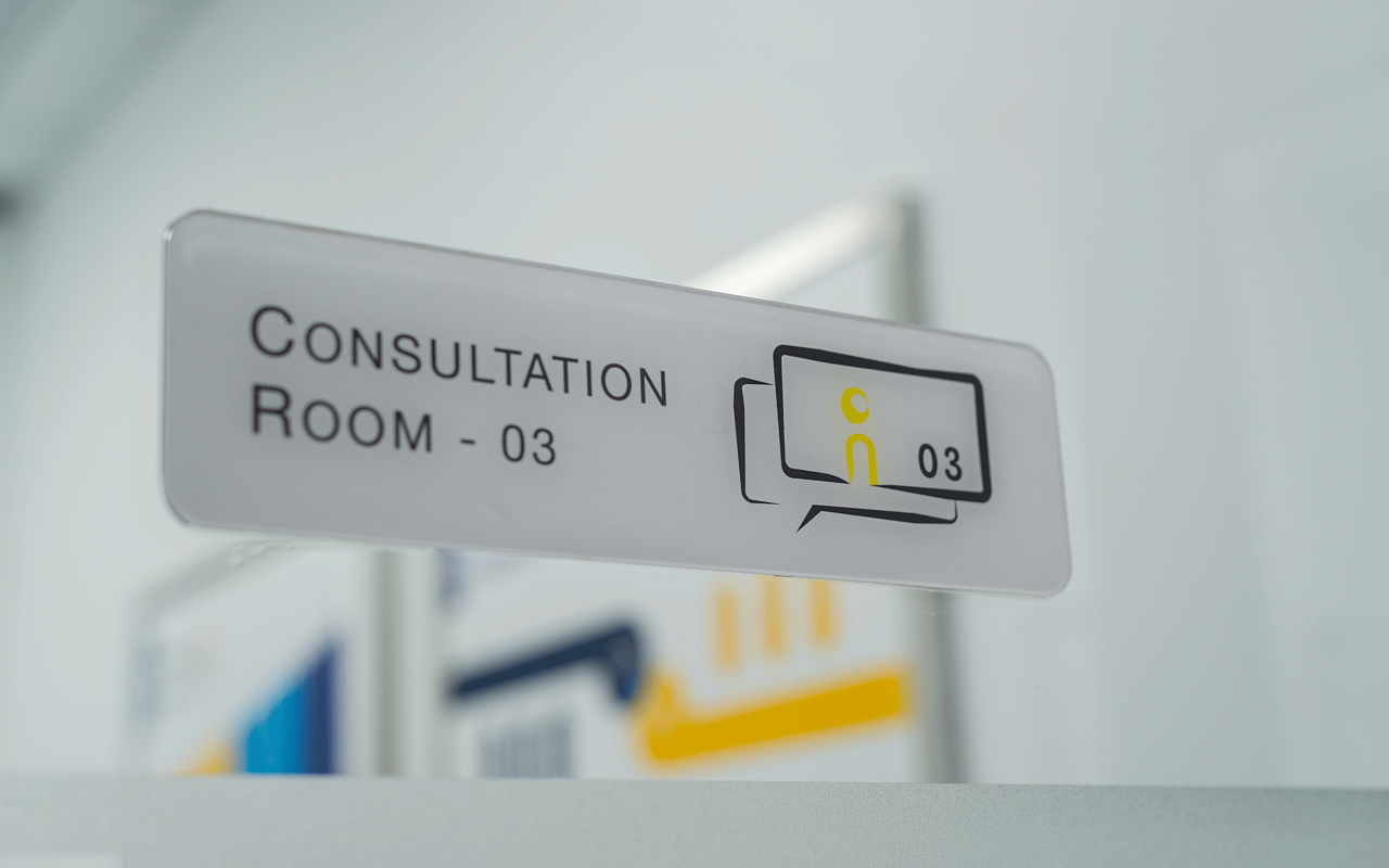
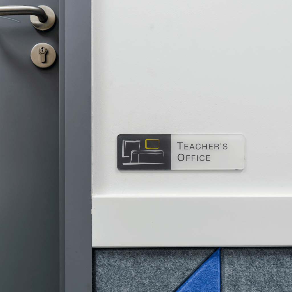
Wayfinding

The possibility of “LE”, which is currently only a snapshot of the moment, will be richer and more colorful in the future. A set of brand design is a product of the moment, and a good brand design needs to be forward-looking in order to grow with customers. This tailor-made dress should be suitable for her work and temperament, plus a little prospect and ambition. The more she travels, the more she finds that it suits her and she feels confident, and she finds fun and tries to enrich her outfits. Our designs are blessings to our clients. Use now, durable in the future. This is what we have been trying to do.
