

Yizheng Stationery is a market leader in children’s eraser in China. This video, though grounded in this category, is not to be mistaken for an advert targeting kids. This was meant to be part of a B2B communications brand building framework.
Project Background
As manufacturers in China transit from OEM, ODM to being brand owners, the founders need to embark on the often unfamiliar process of brand building. This process of building their brands from scratch is an onerous task, and with so much to do, knowing where to start, and subsequent project phasing is key. Here we decided to embark on B2B communications first, before tackling B2C touchpoints. It is more direct, and cost effective, without taking too much time tackling market segmentation and product line architecture issues. Especially important for small medium enterprises (SMEs), is for the brand consultants to deliver in as quick a time frame as possible a solid response and ROI for the inception phase. Only then will the SME be confident enough to embark on the next phase in the long process of brand building.
Our Approach
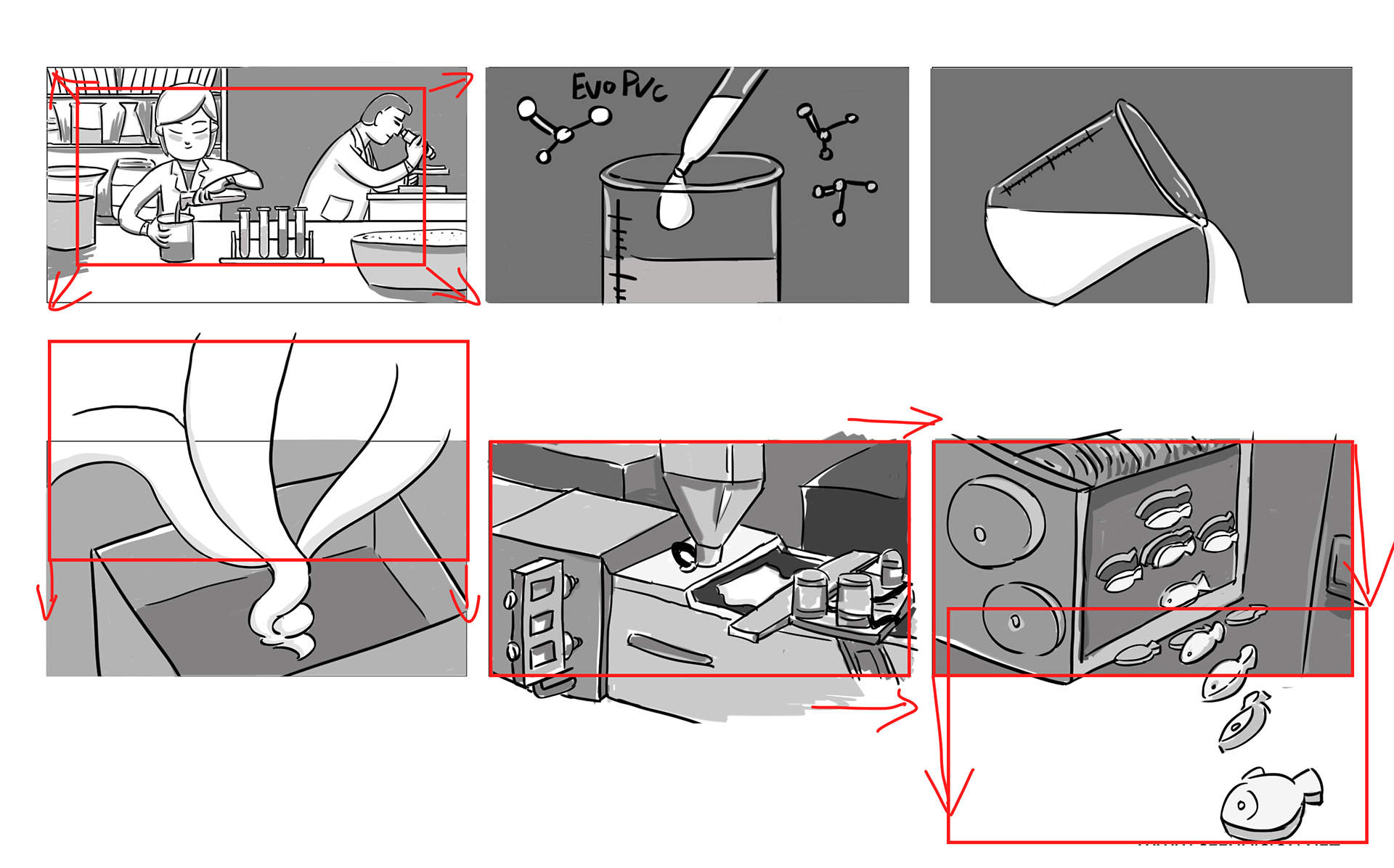
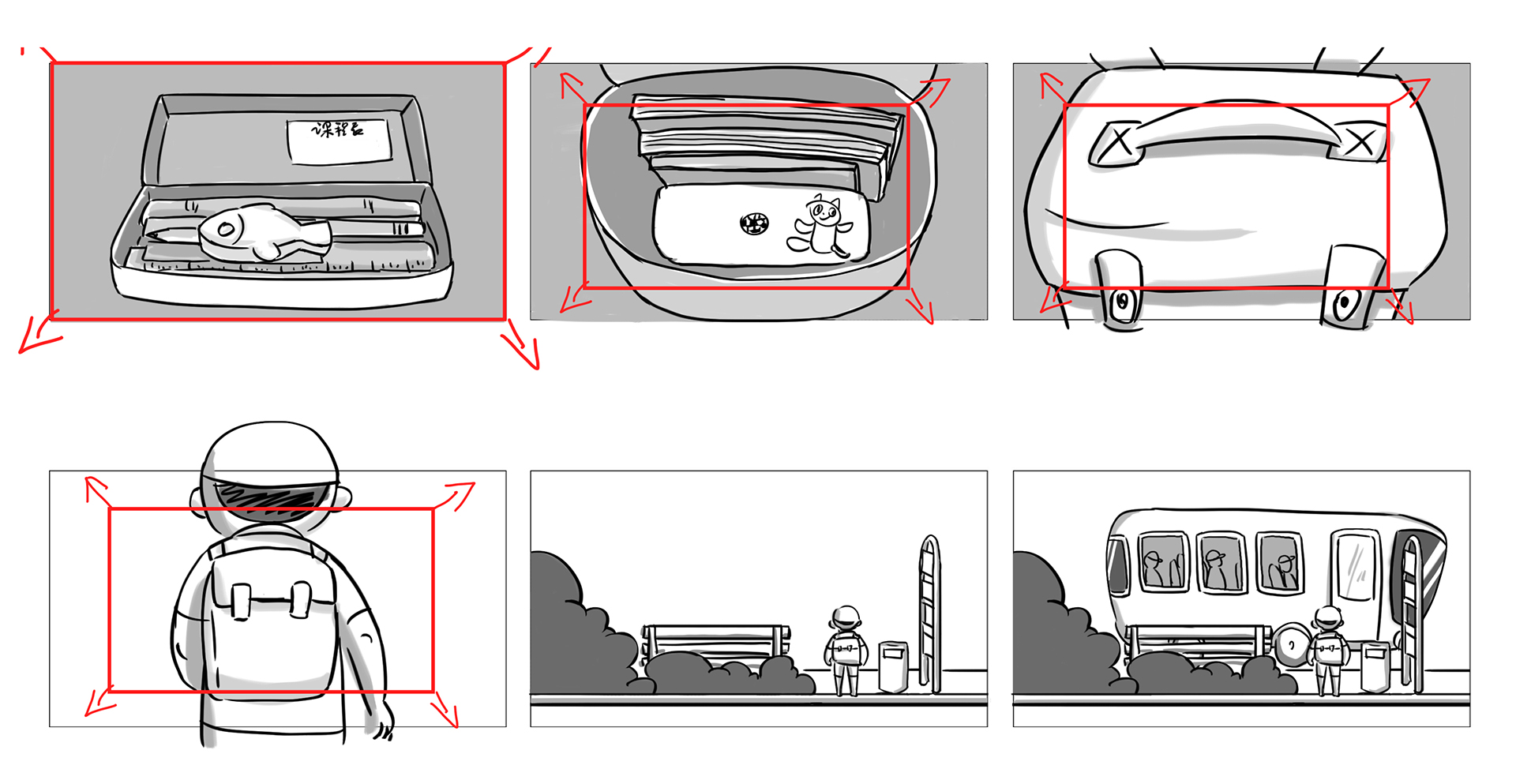
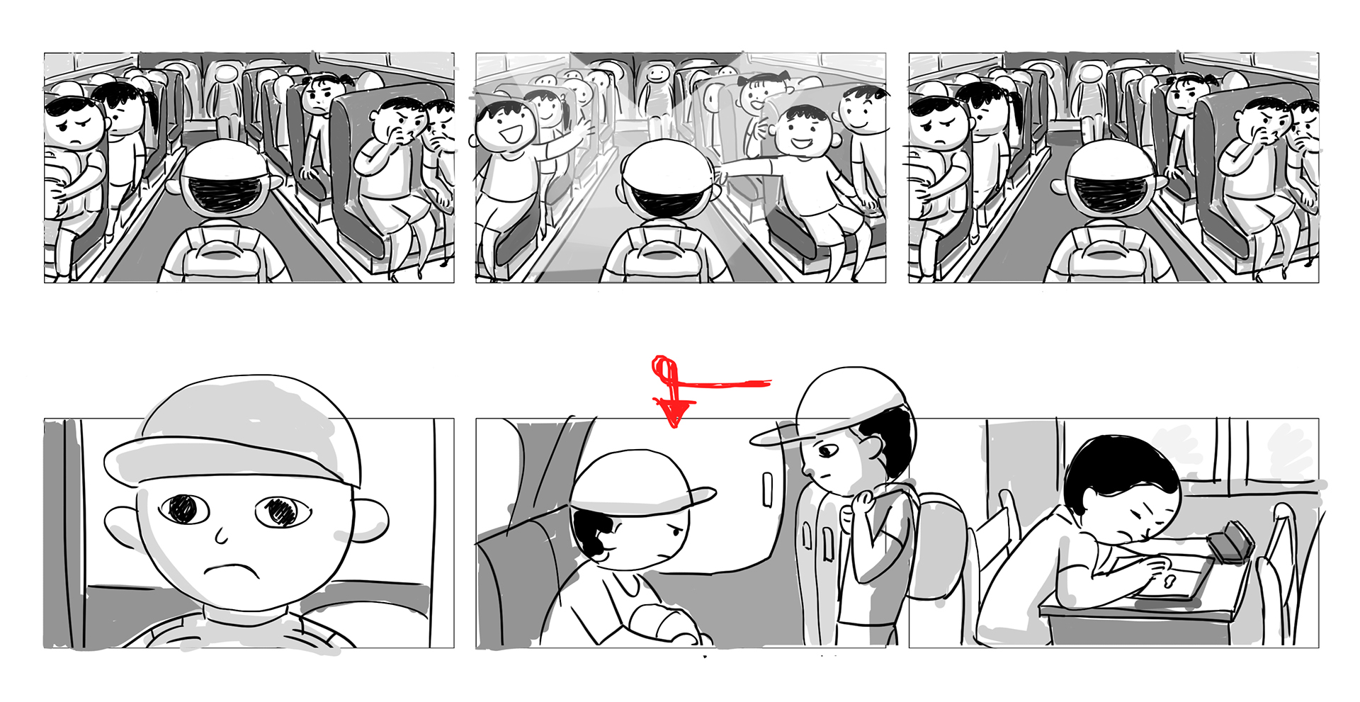
We left the logo largely untouched, but our aim is to bring the brand to life, make it relevant to both their partners and consumers eventually. Corporate brand videos targeted at business partners traditionally focus more on their manufacturing prowess and production capabilities. This type of execution puts viewers to sleep, and is ineffective in communicating brand prowess. When everyone does the same thing it no longer convincing. We decided to use an eraser’s journey, to develop a double parallel narrative. One that is the eraser’s and also that of the child’s. A story of mutual growth and companionship. And unobstrusively, we tell of the R&D and production process, til it reaches the hands of the end user and the emotional connection that is made.
Our Concept
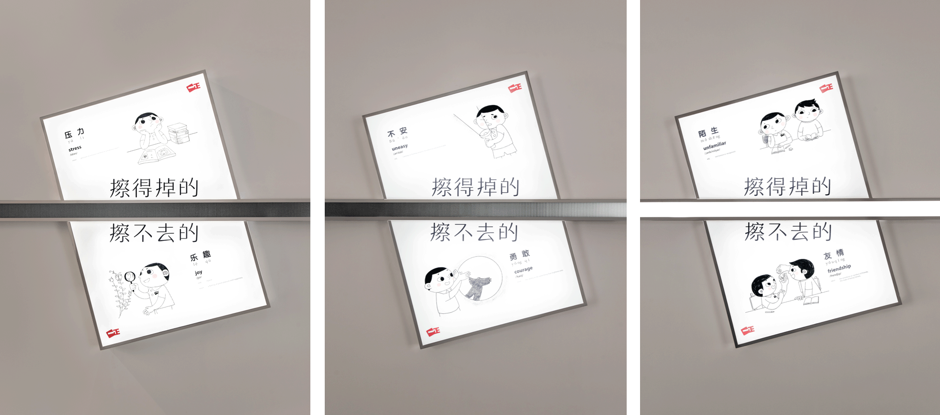
From our childhood, we all have good and bad memories. But as we grow older, the bad ones tend to fade, leaving the good ones. This is the empowering message that we wish to leave with parents. Everything has two sides to it. If we manage to overcome the short term difficulty, the reward is often life long. Once we overcome the unfamilarity of making friends, the friendship could last a lifetime. From this concept, we developed five posters, one of which this video is an elaboration of.
Animation Artwork
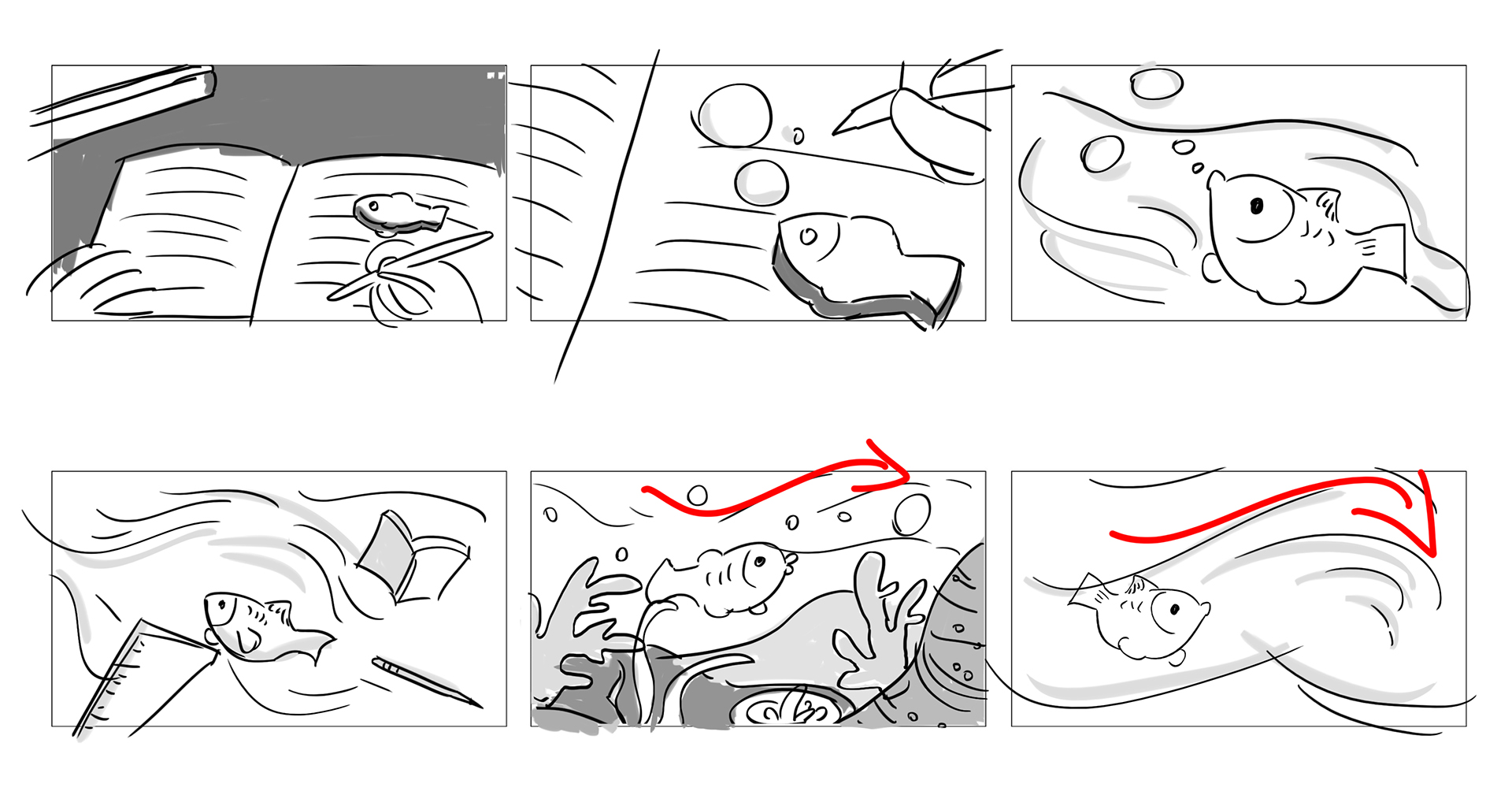
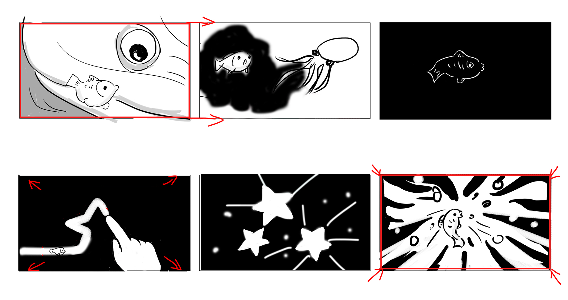
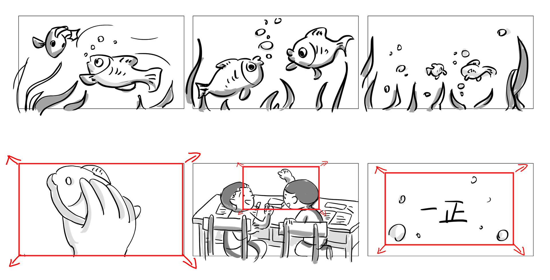
In terms of tone and manner, we don’t want something too polished that distracts. Instead, single line drawings were intended to draw the viewer into the minds of children, their fascination, their trepidation, their rich inner landscapes. And throughout all this, the eraser is more than an eraser, it is a companion on this amazing journey.
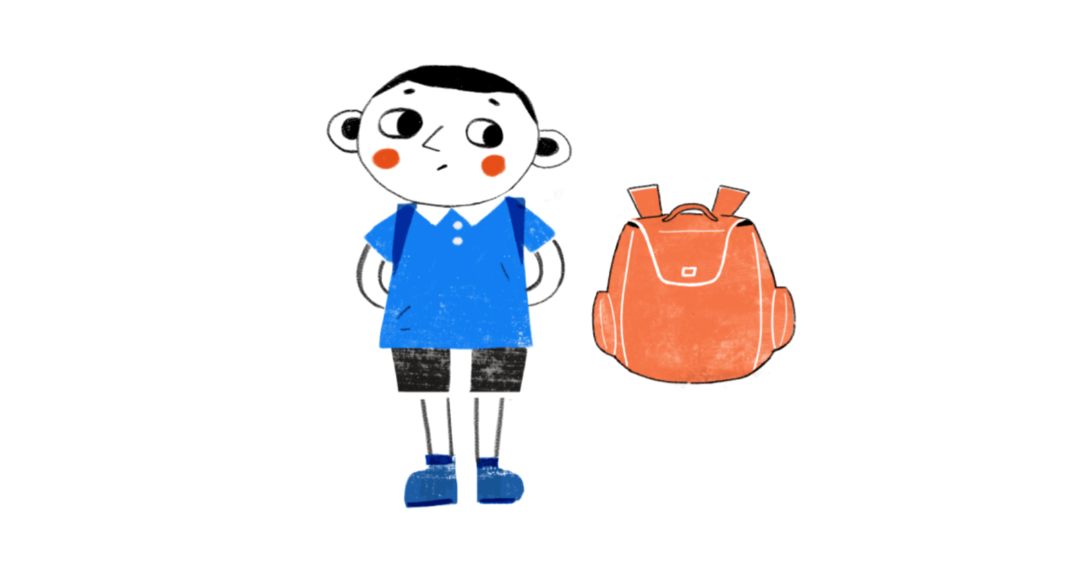
Protagonist

Hero

Co-stars
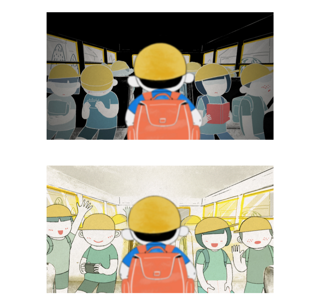
Reality vs Fantasy
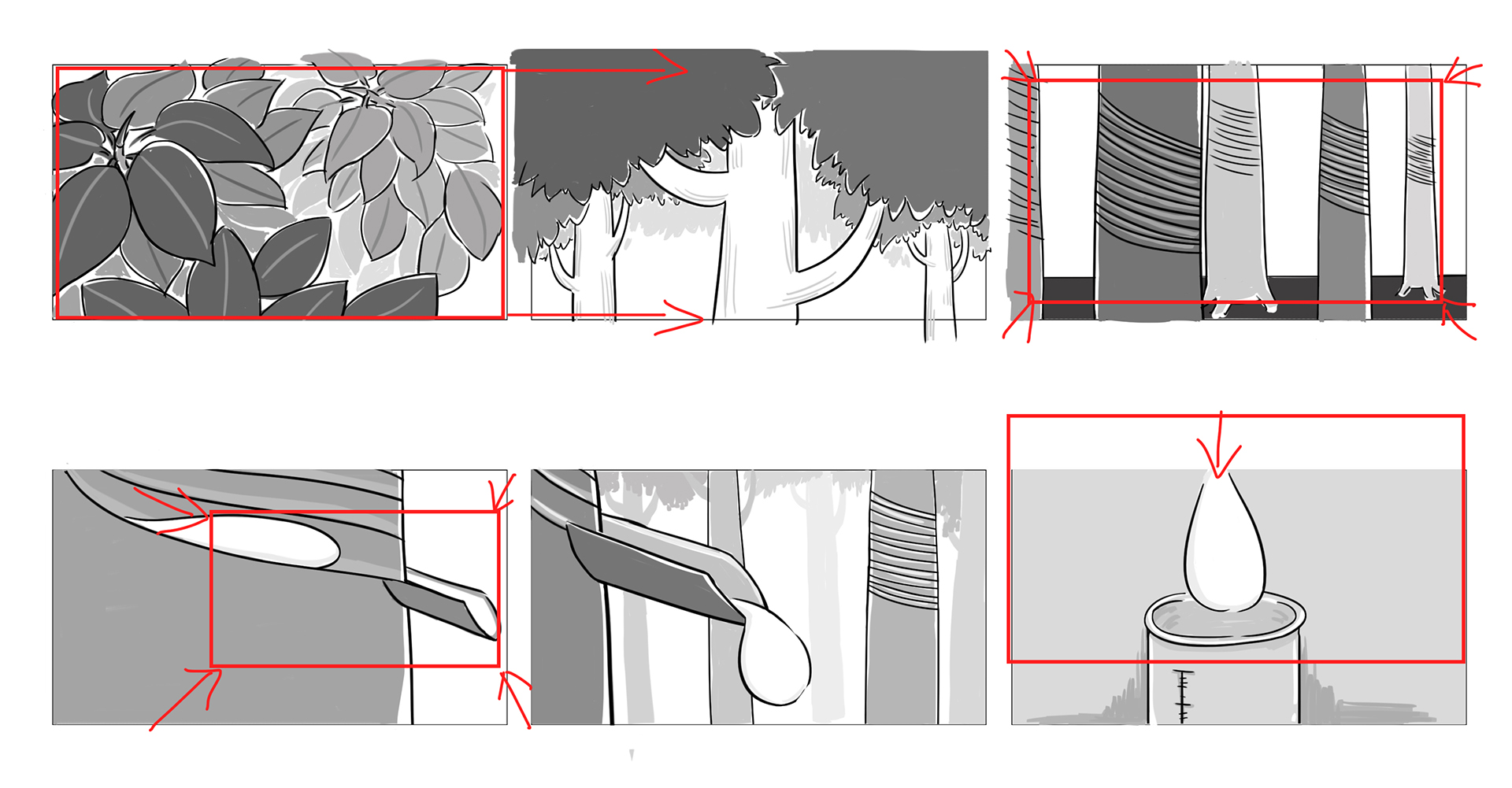
Storyboard
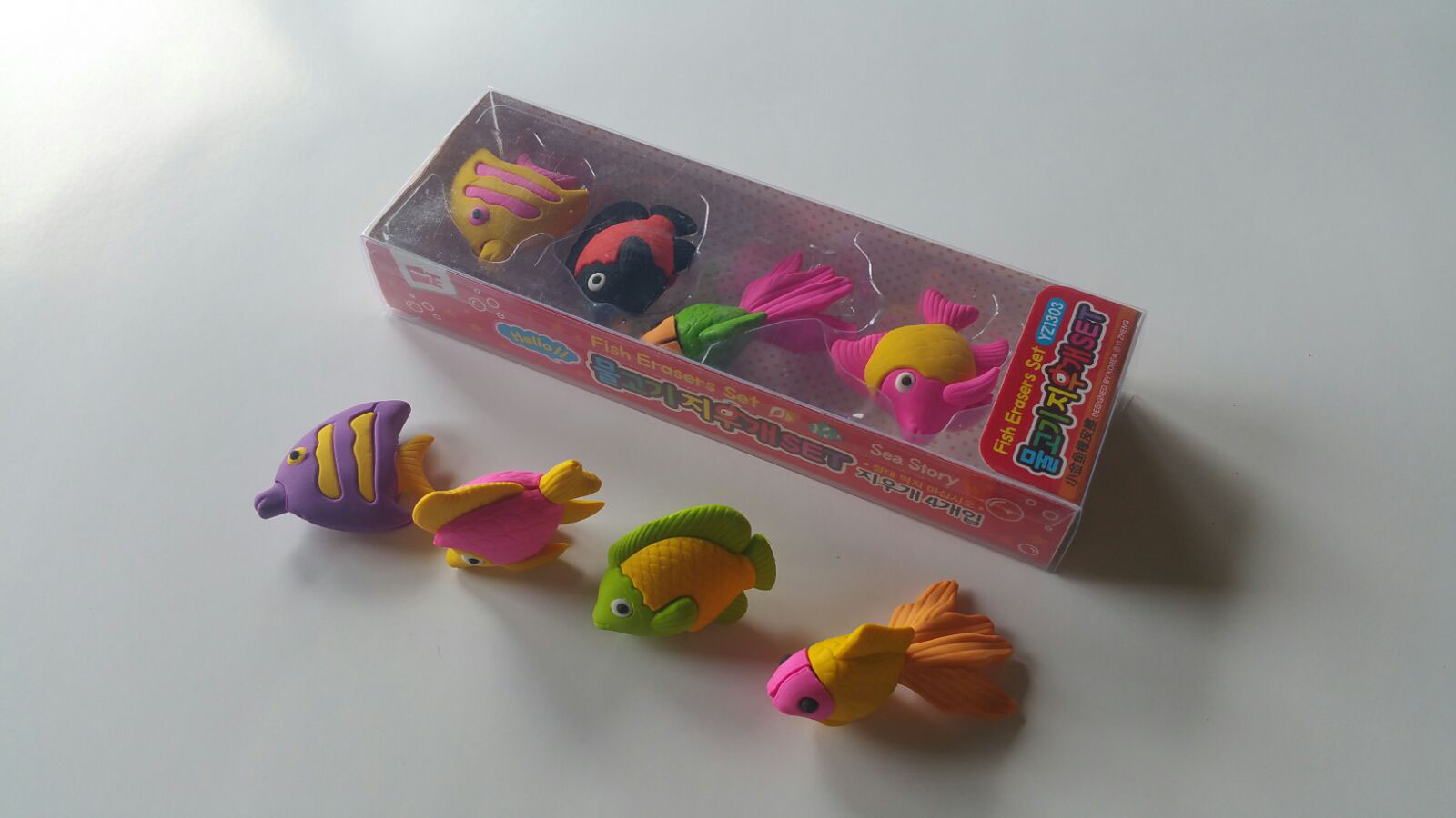
And the characters are based on
There’s more!
This video is part of a bigger rebranding project. Erasing (discomfort) with (courage), is key concept that threads through our over arching creative and design executions.
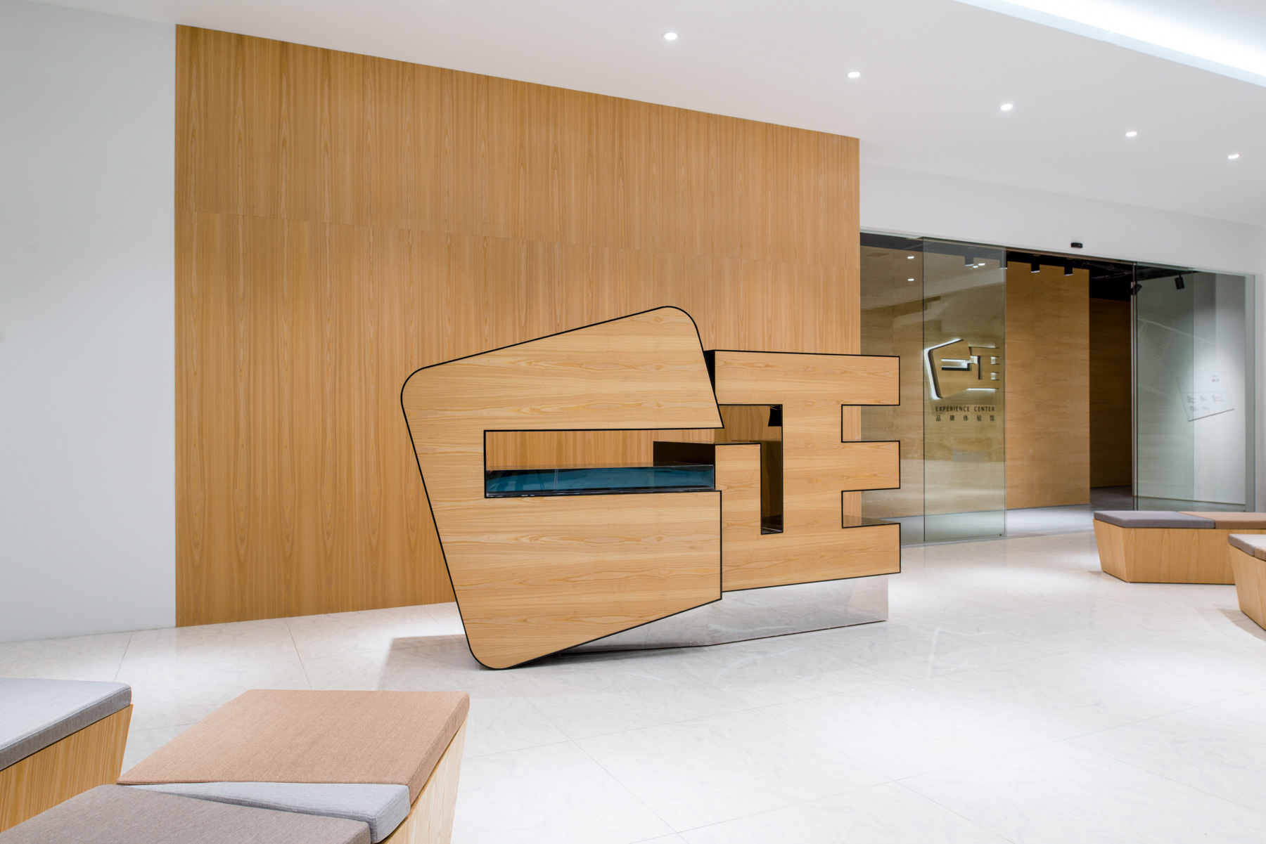
For more, pls see our other project Yizheng Brand Experience Center.
TEAM MEMBERS :
Overall Concept, Interior, Graphic Design: United Design Practice
Animation & Illustration: Seenvision
Music Composition: Tze Toh
Lighting Design: Light Collab
Construction & Engineering: NFH
Photography: Feng Studios
AWARDS
A’ Design Award
Interior Space & Exhibition Design, Silver
Interior Lighting Design, Bronze
Vega Digital Awards
Animation , Canopus Winner
Writing / Story , Centauri Winner
Directing , Arcturus Winner
LIT Lighting Design Awards
Interior Architectural Illumination
Light Art Project
Graphis Design Annual
Gold Award
IDA International Design Awards
Multimedia: Animation, Gold
Interior Space & Exhibition Design, Bronze
Interior Lighting Design, Bronze
ID+G Award
Interior Space & Exhibition Design, Silver
