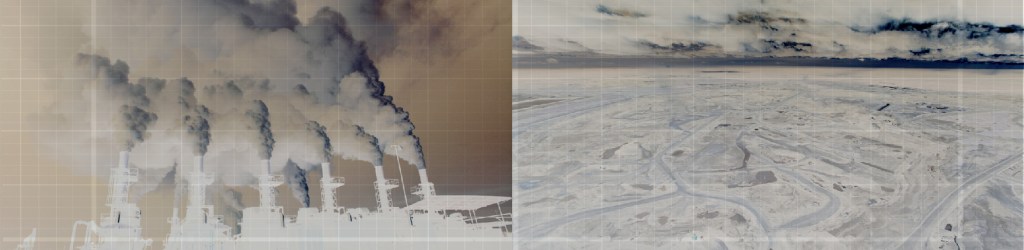
Greenpeace does a lot of good work in China. Championing many causes in line with government reforms, in environmental protection, promotion of sustainable energy, anti-pollution measures in particular.
For this project we worked with the Climate and Energy division. The issue was that there wasn’t an overarching visual identity, and as each design partner has free rein to explore the needs of the particular project, when viewed as a whole, their visual communications lack consistency and clarity. But their needs are as complex as the issues are, with interweaving messaging and audiences. The greatest challenge is thus the need for a strong identity on the macro level, yet flexibility to adapt to different tone & manner and messaging on the micro level, that is the only sustainable solution from a brand communications point of view.
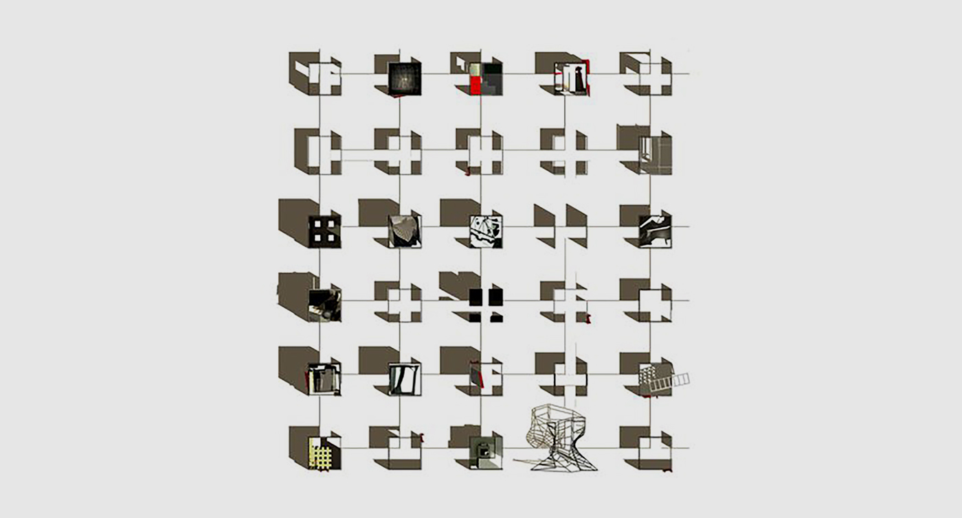
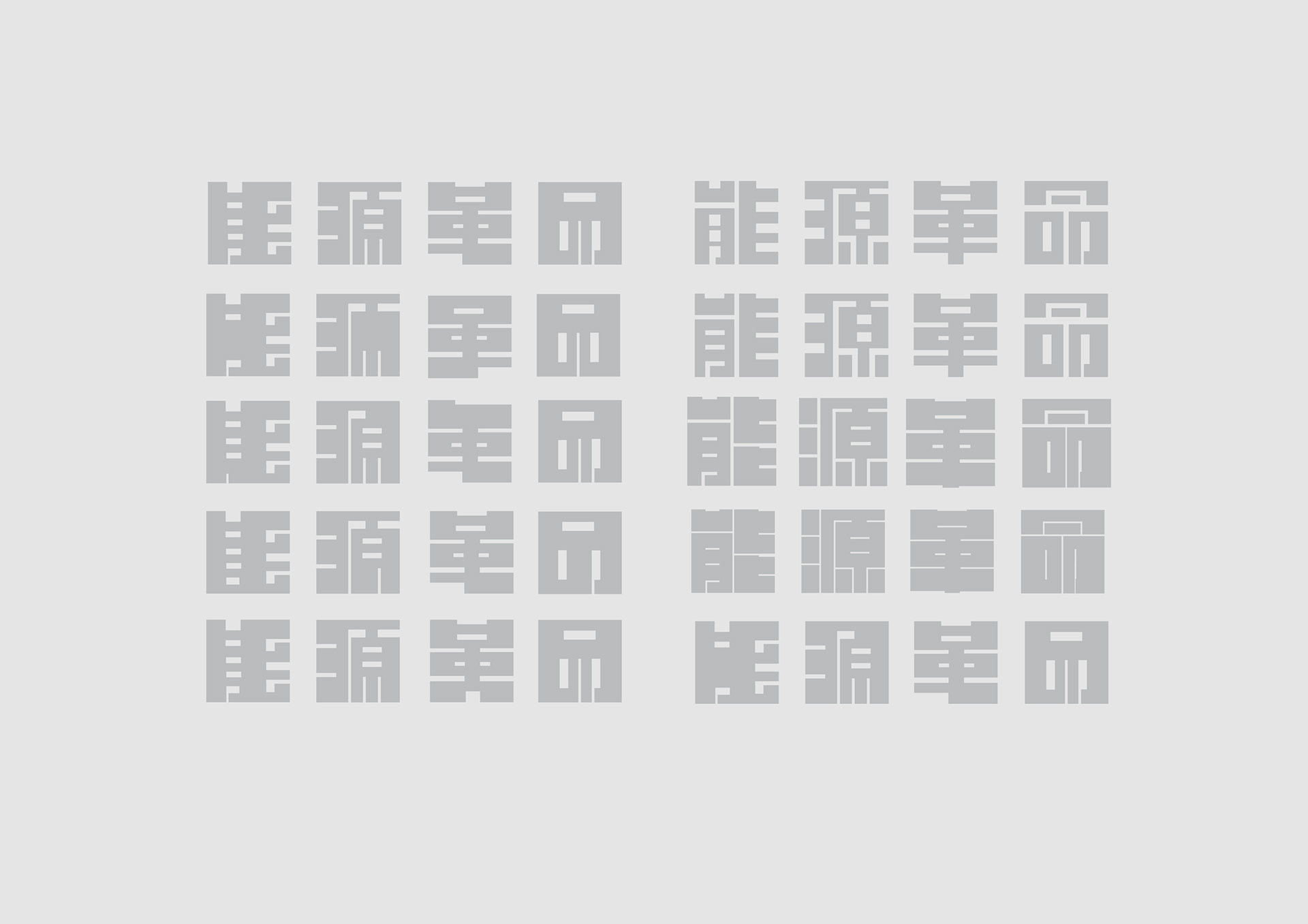
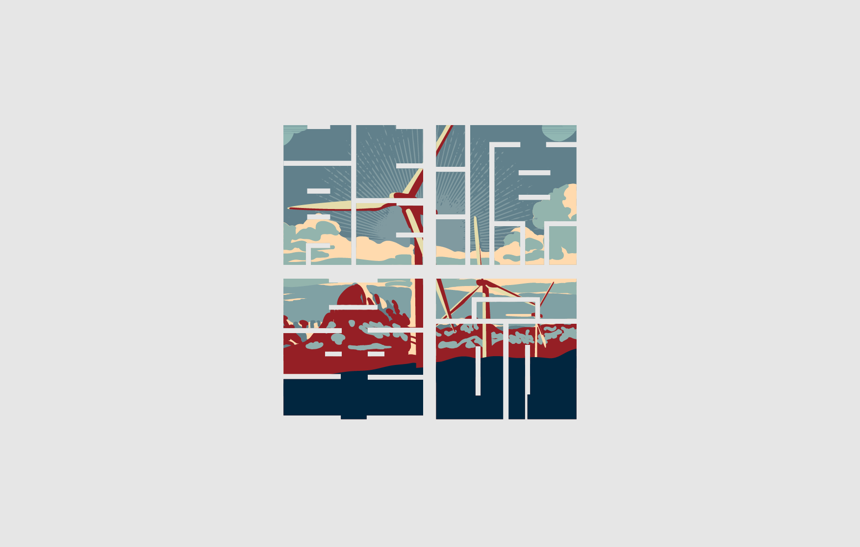
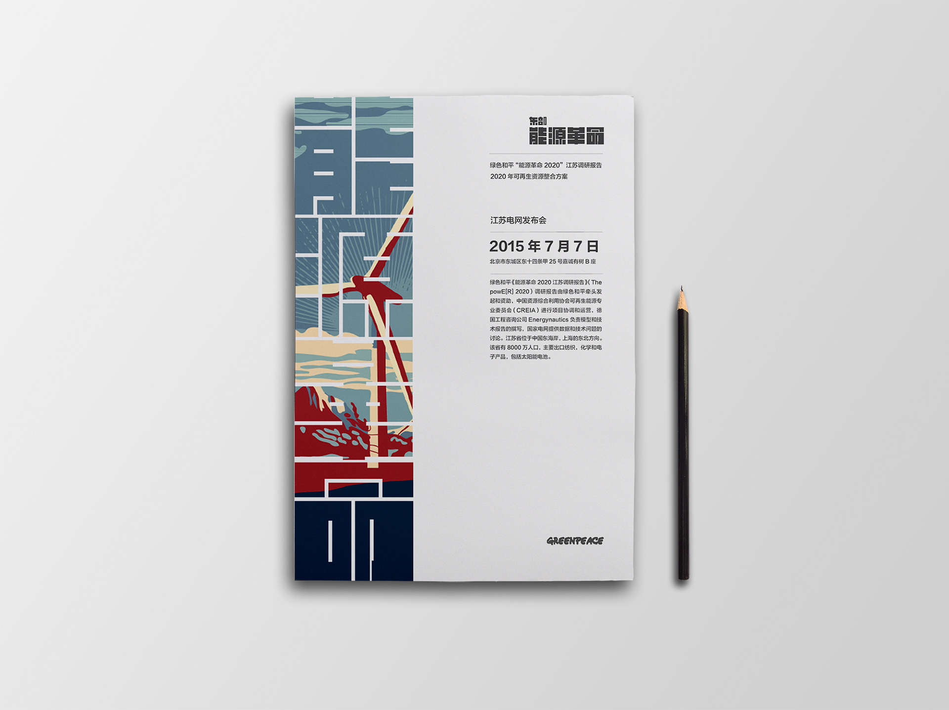
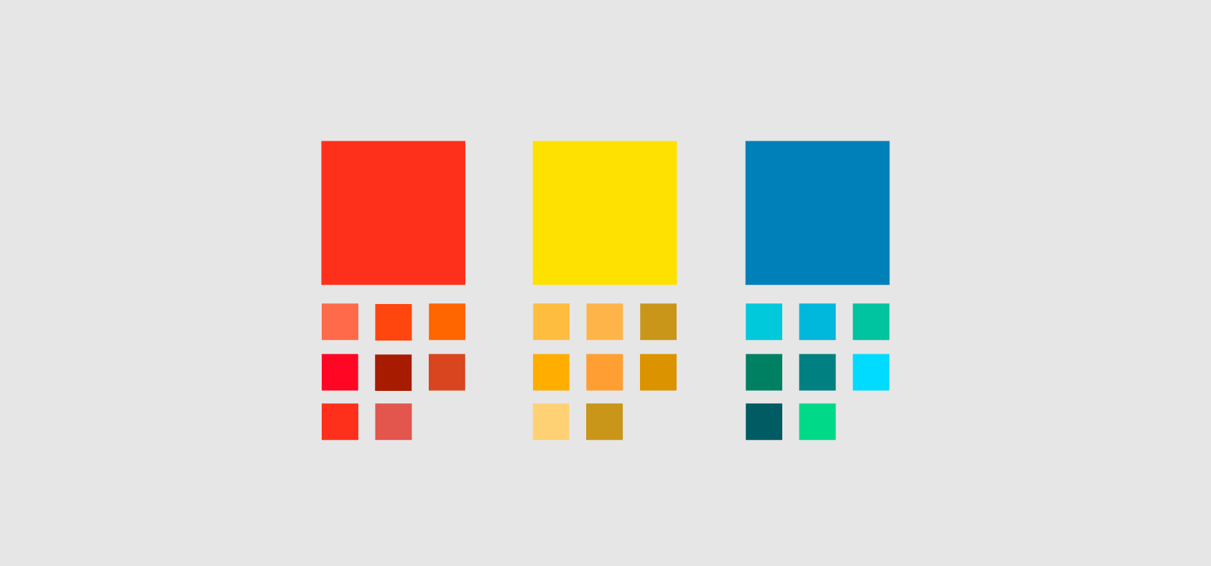
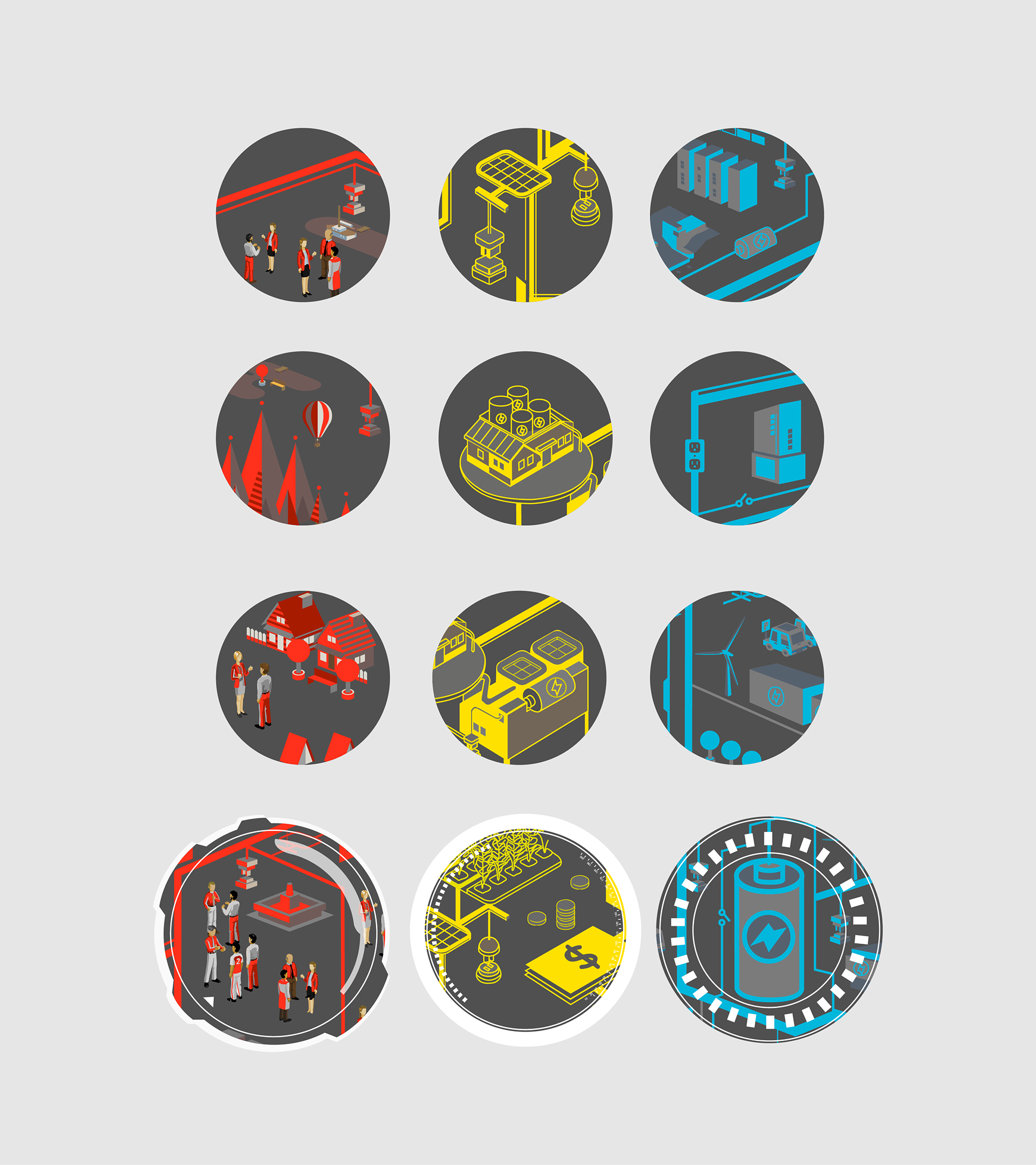
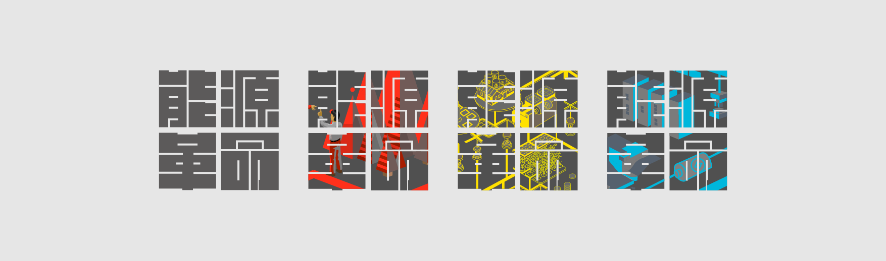
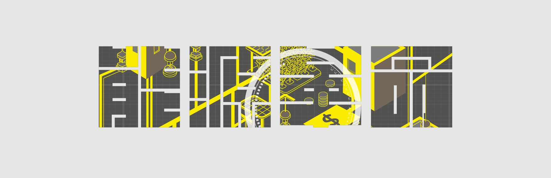
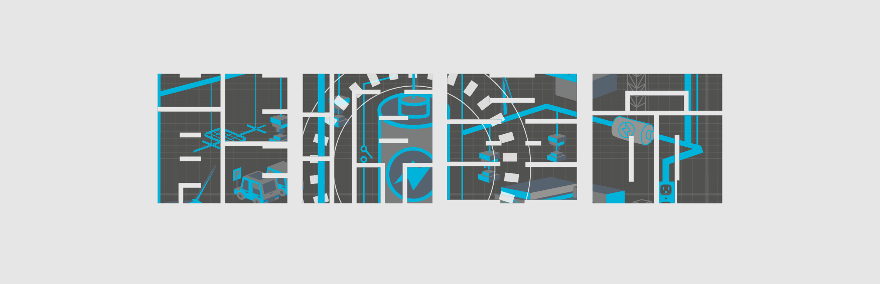
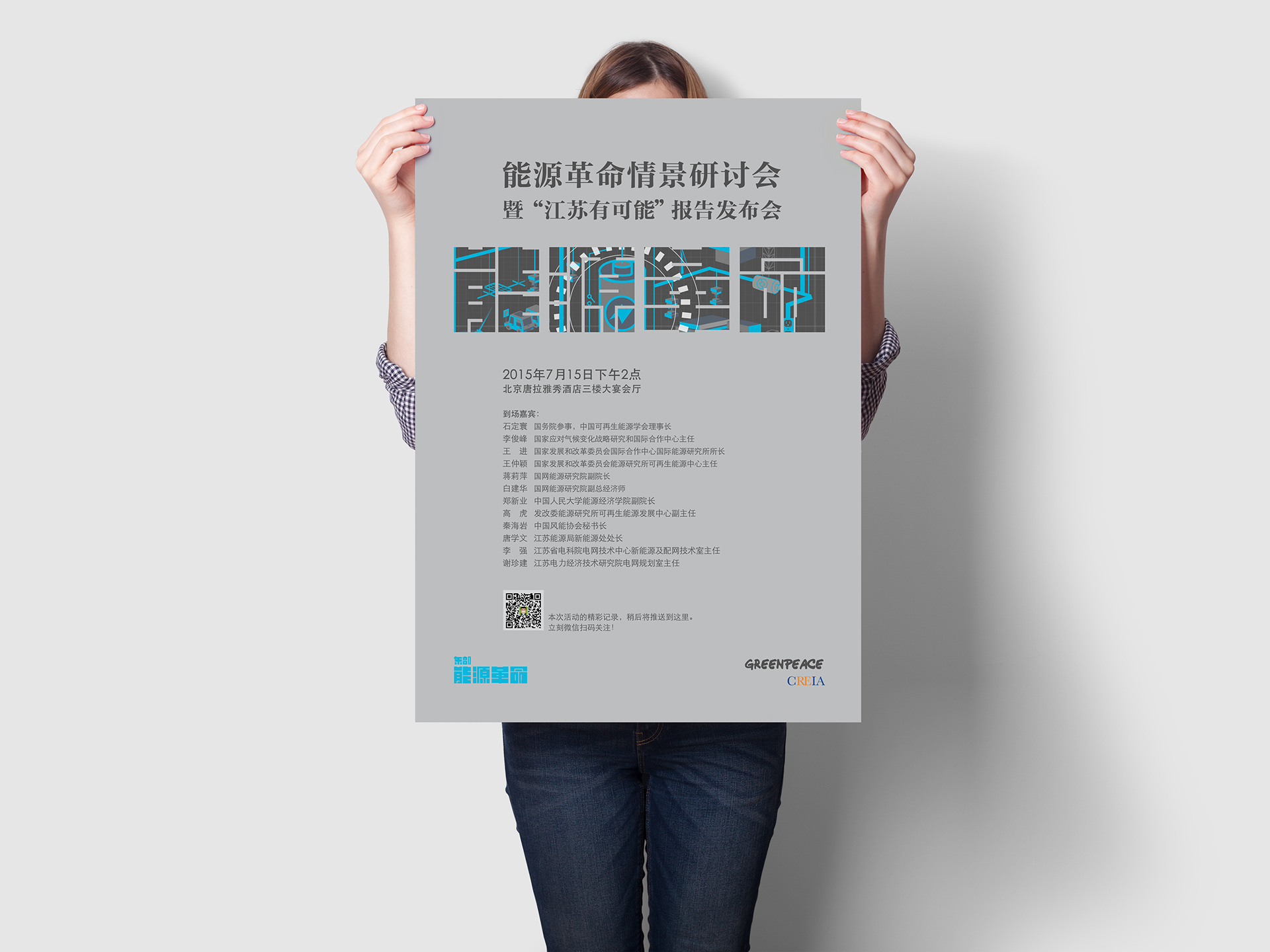
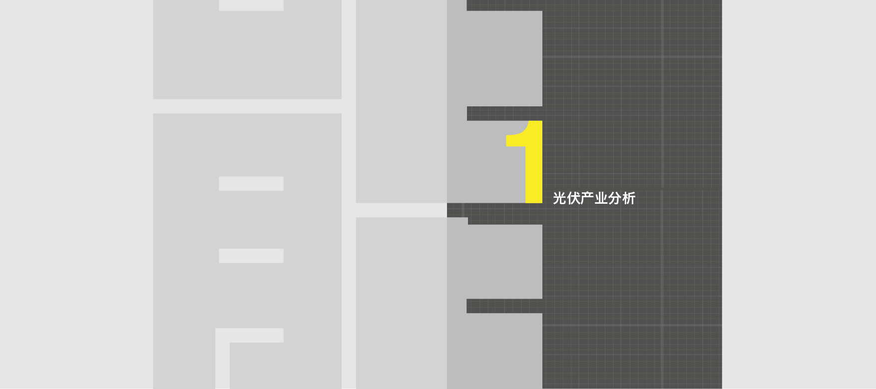
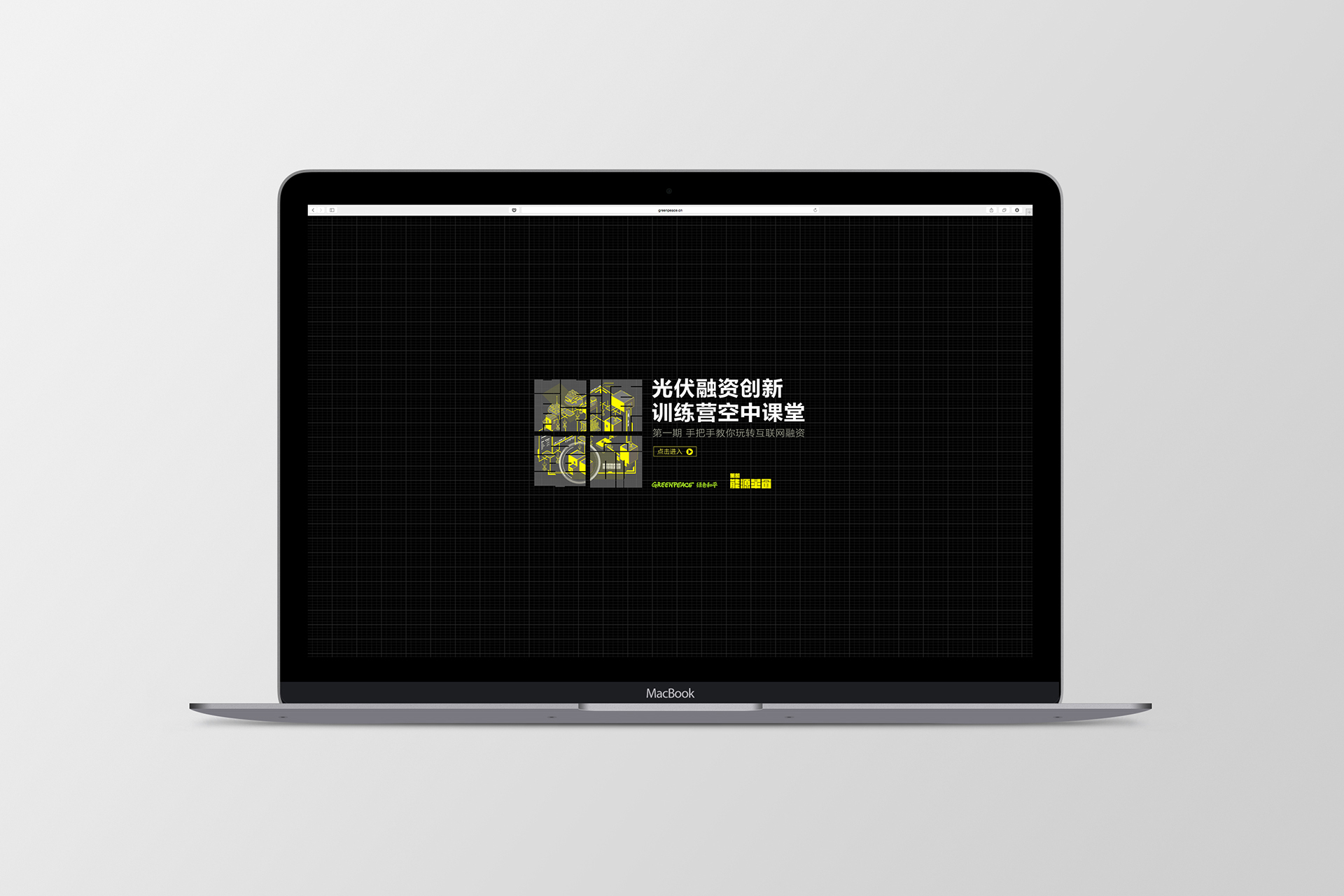
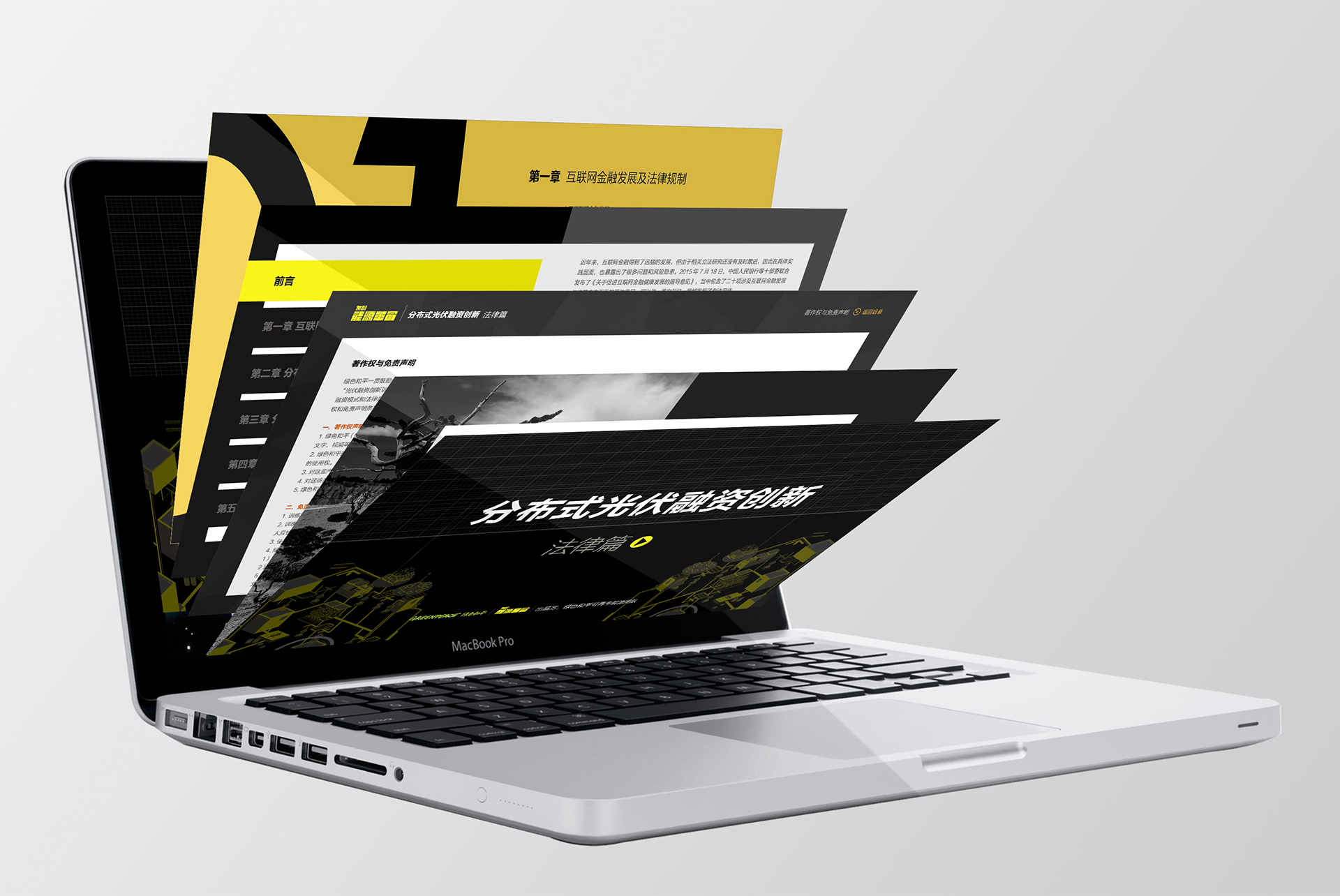
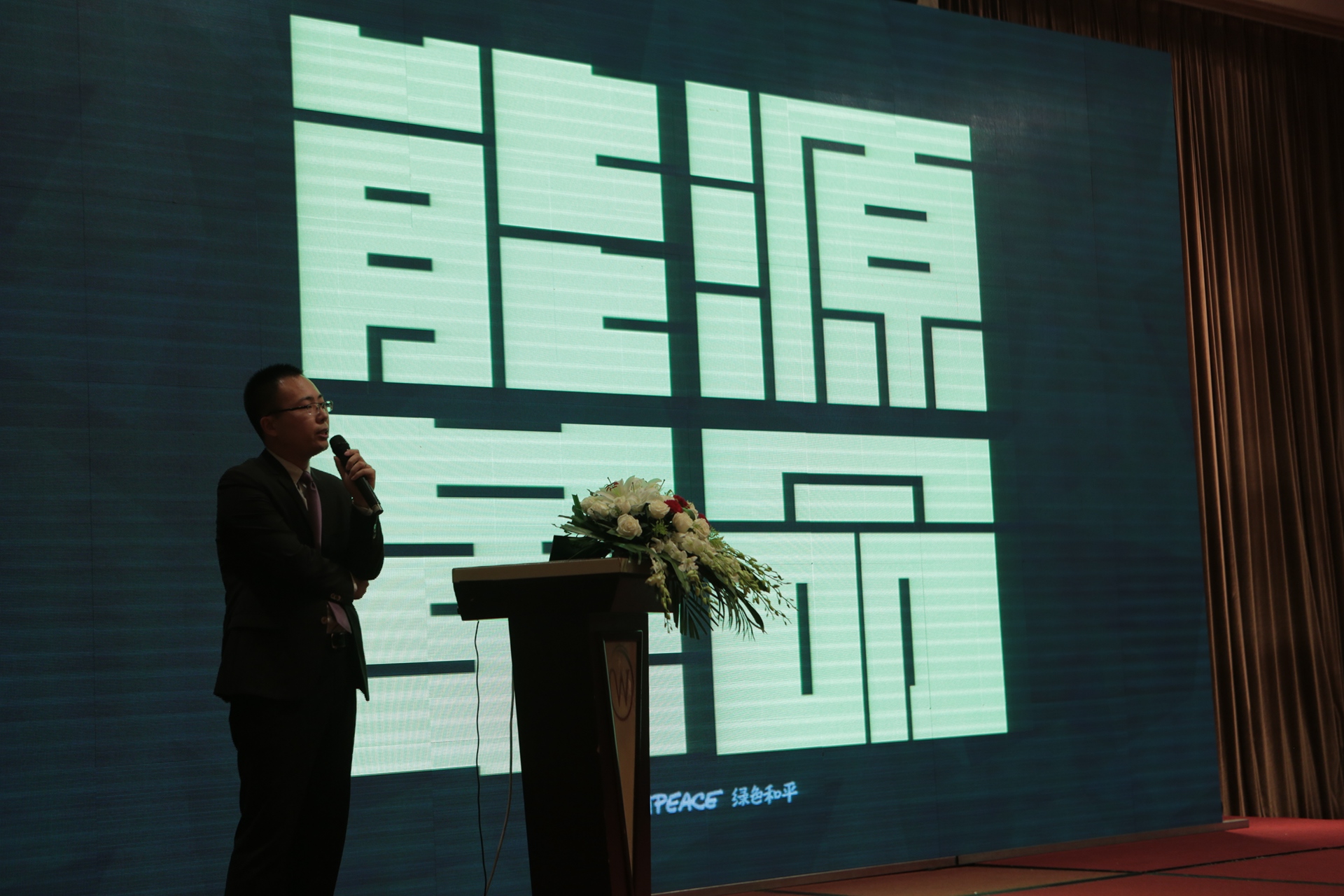
First of all we worked with them to organize their communication needs. We found that this can be broken up into 3 categories, according to their target audiences, namely 1) government & industry experts, 2) investors, and 3) the general public. Besides assigning a key color palette for each, we also designed a Key Visual (flat graphic style) that referenced the key issues addressed to each audience. A primary logo (能源革命 meaning Engergy Revolution) is designed that is also used as a cutout to embed different brand assets. Later on 东部 (referencing the Eastern parts of China) is added as a prefix to lend credence and alignment to messaging needs.
We created a branding system that is clearly differentiated as a whole, with reusable brand assets that can be utilised in subsequent activational programs, and easily updated and replaced if need be. A system that is strong visually yet flexible and adpatable to future needs.