Answer Communications is a marketing and communications company based in Shanghai, servicing clients in the luxury market, with a focus on cosmetics and fashion industries. These industries in particular are highly competitive in terms of marketing spend and how to best communicate with consumers.
Answer Communications
Also the marketing landscape in China is evolving at a furious pace, corporations need to keep up and adapt to new communication channels like WeChat and Weibo (Chinese Whatsapp and Twitter) as quickly. Plus the fact that Chinese consumers are becoming increasingly savvy and resistant to brands pushing through their messages, consumers need to feel they are engaged in a dialogue with the brands, rather than being talked down to, or feel that they are being hustled to buy.
Answer, bridging the gap between brands and consumers, needs to demonstrate they are at the forefront of communications, that they can initiate the dialogue, that they can sustain the conversation between brand and consumers.
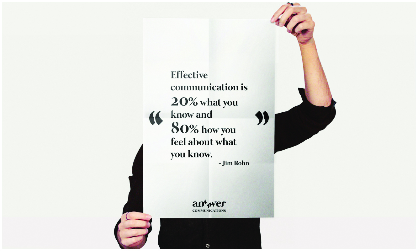
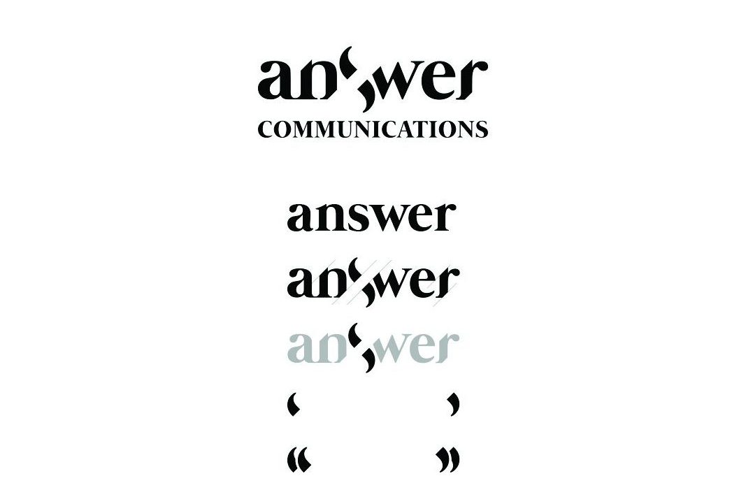
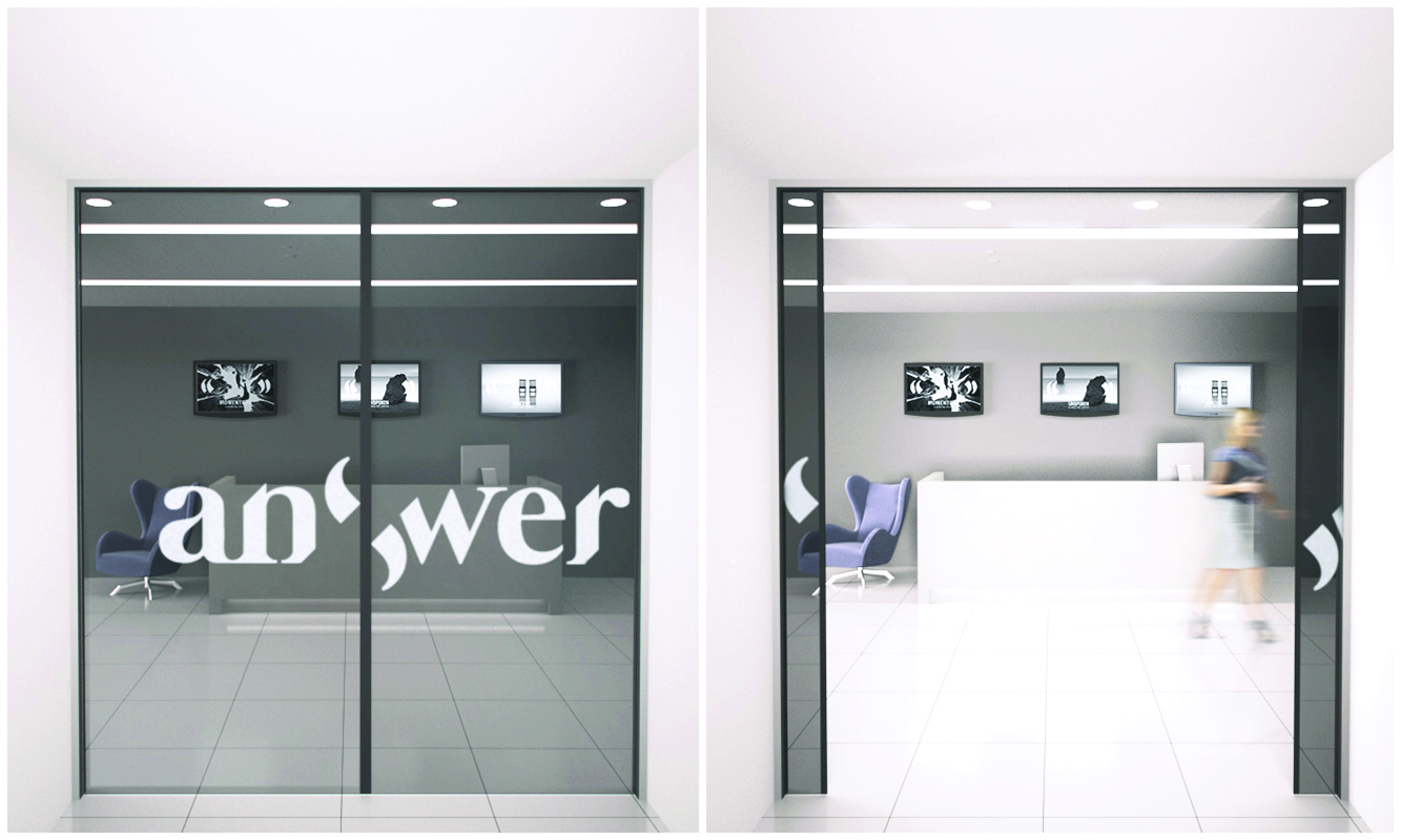
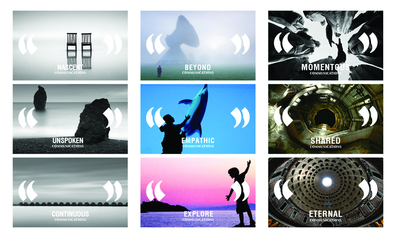
Hence we have chosen to express their branding with the process of communications itself. Two quotation marks come together to form the S in answer, they open up in the middle to start the conversation, and they evolve into double quotation marks to hold the contents of the communication.
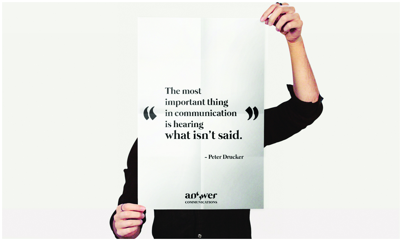
Communication is not just verbal, it is visual, it is tactile, it is also the unspoken, the heart felt, the space in between. That is what we set out to express in the branding.
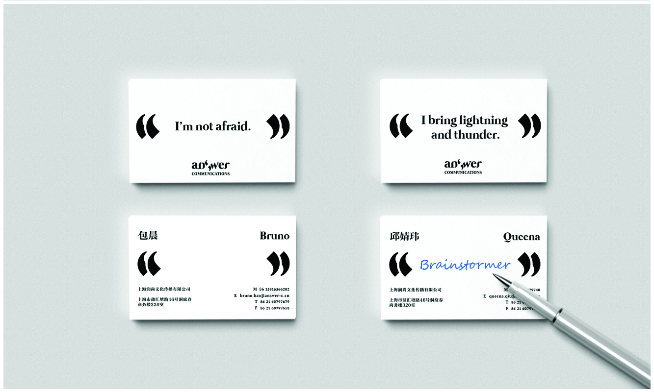
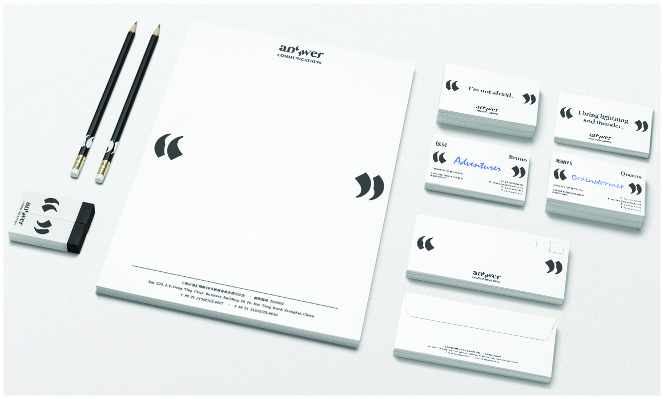
The namecard is often the conversation starter in the business process. The front side features a quote from the employee, the back requires input from the other party. At the end of the business meeting, the receiver is encouraged to write what is thought about the other person, what kind of person he/she is, what was most memorable about him/her. This interactivity is our reinterpretation of the business communication process.
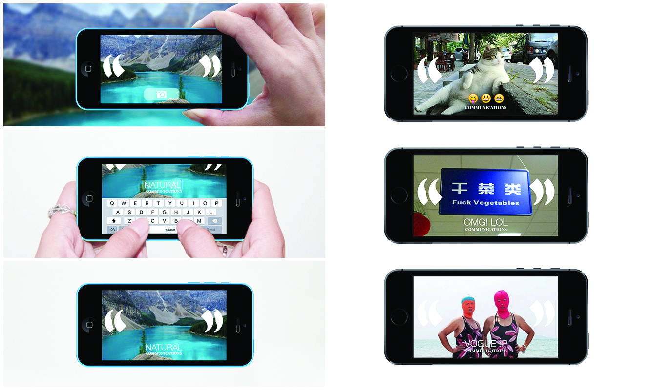
For ideas in the digital realm, they need to be more fun and playful, so that user-generated content can catch on in the social media. It is a variant of our postcards, except that users take the photos themselves and type in one comment to express their take on communications. They can then send the images to their friends or post it online. From cute cats and dogs, to inane signages, and inexplicable fashion disasters, they can let their imagination run wild and do a running commentary on communications.
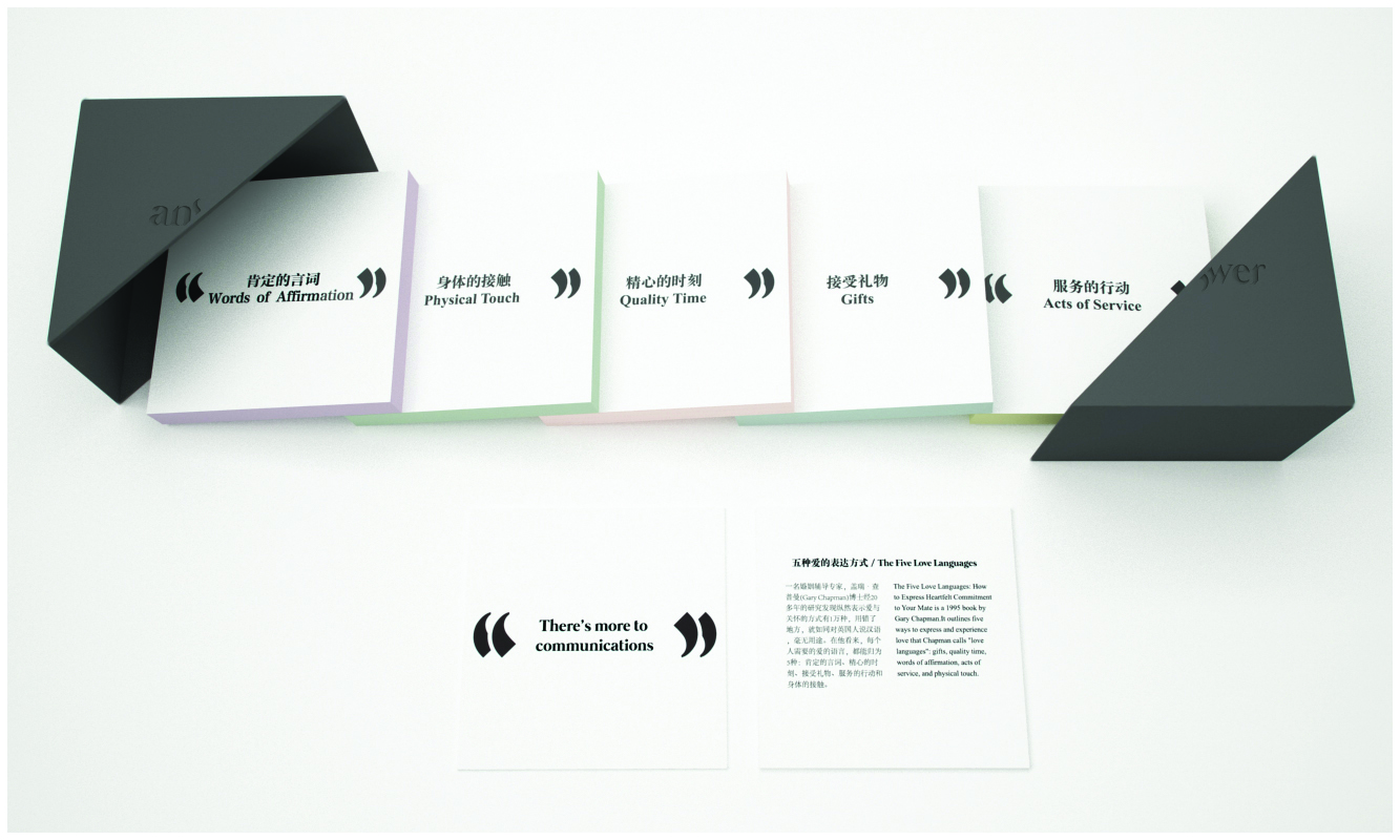
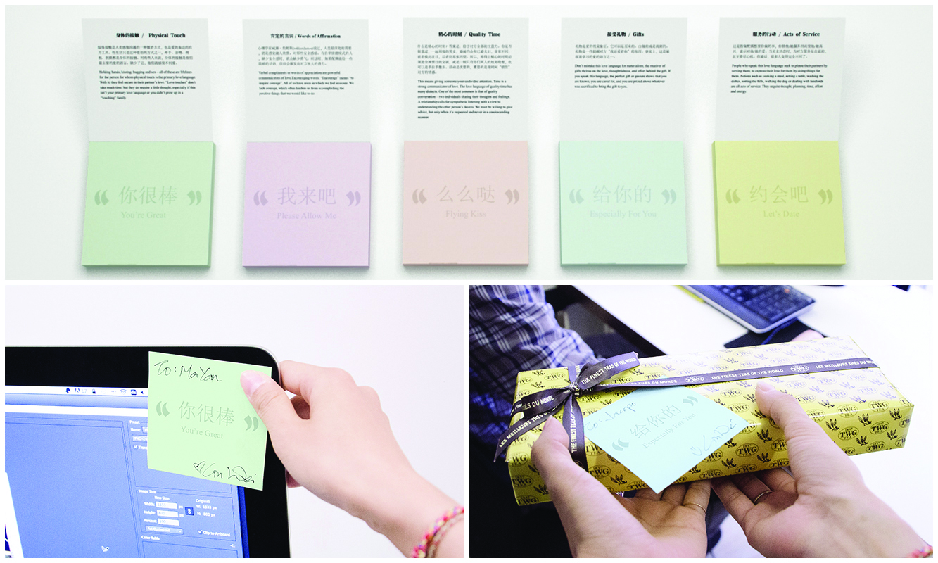
We want to show our corporate partners that we care for them, and truly an emotional connection is the surest and most basic component of any relationship, especially a business one. So we used Dr Gary Chapman’s 5 Love Languages to empower the end user to more easily communicate their love to others. 5 post-it packs each embody one love language. For people lousy at praising, they can stick ‘You’re Great’ on someone’s computer monitor, hard to verbalize but easier to stick a post-it and express one’s appreciation. They come together in a pack of 5, all in a black box. The embossed logo in the middle opens up to facilitate this communication of love.
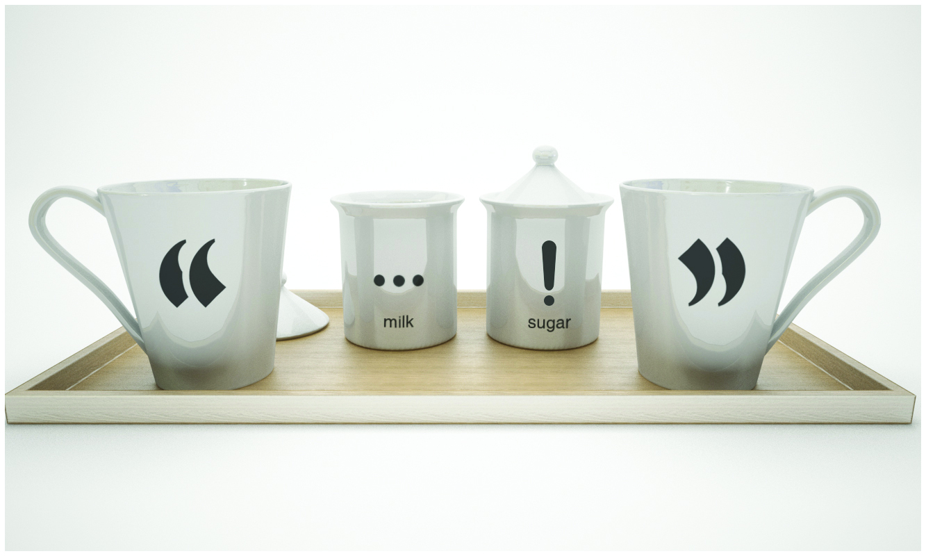
Two persons holding two coffee mugs with one set of quotation marks each, each embody one side of the conversation. The conversation is the invisible space that is between them. On a tray, the milk and sugar adds their own flavour and expression to the conversation. The mildness and calm of milk, sit together with the excitement and surprise of sugar, and bracketed by the mugs on both ends.